
just a blog to store cool gif tutorials and resources <3 thank you to all creators!
182 posts
Joshiemakesgifs - Gif Resources Dump - Tumblr Blog
yo what procreate brush do you use for lineart it looks really cool :o
hi there -- i use a variety of brushes depending on the mood, so i'll make a nice lil compilation of my brushes to cover whichever one you're curious about!! thanks for ur interest 🥰
first off, the very recent BIC pen mimic i got from here:

and it looks like this:

it benefits from a lighter colour (can be used with grey/unsaturated colours), it's worth trying out a few for fun. its grain blend mode (brush -> brush studio -> grain) is set to multiply, so i think that's where it gets its light-to-dark gradient from.
then, there's this one:

which is an edited version of the default Tamar brush. i added jitter settings, which are the reason for its wiggles, and pen sensitivity. i love to use this one to give more simple drawings some extra flare.
and its sibling:

this one is basically the same, but with NO jitter and added stabilisation. :-)
the last one on this list:

i call her 'derwent highpressure 2 2 2', aka this is the culmination of me repeatedly editing & refining the default Derwent brush. the pressure sensitivity is super high because i wanted to get a range of pen thickness without affecting my sore hand too much. it's got a small amount of texture & jitter to it, and i'll be honest, i don't remember what the original one looks like.
to absolutely Anyone: i really encourage playing around with procreate brush settings because, although they're a bit difficult to comprehend at first, they're pretty open in terms of how you can mould them. plus, you can employ personally made textures & shapes (or free ones) to add subtle effects. it's fun! i have a whole dock of speech bubbles, decals, a watermark brush, body hair & feathers, etc. :-)


Here is a round-up of all eight of the free digital brush packs that I’ve released so far for Photoshop CC, Clip Studio Paint, and Procreate!
You can download them on this page (click) Type in “0″ for a free download or tip any amount you so desire!
All my brush packs are totally free (tips optional but always very appreciated!) and can be used freely in any work, including commercial work that you profit off of, with no license or credit required. My goal with these brush packs is to make digital painting feel more achievable and accessible - especially painting environments, something I now LOVE but that used to intimidate me, & felt much more approachable with the right tools! Many of the packs also come with tutorial video content. I hope you enjoy!


Long time no see Tumblr! did you know I now make Procreate brushes? well, now u do! link: https://stephasocks.gumroad.com/


FREE PROCREATE BRUSH PACK TIME
LOOKIE:

Also look here for another!


foggy-day:
hamhammers:
datfur:
shouisaderp:
anxiousmonster:
starsburn:
CG Texture
TextureKing
Fabric Tales
Mayang’s Free Texture Library
Spoonflower
Seamless Textures
Squidfingers
BittBox
100+ Seamless Patterns Great for Creating Website Backgrounds
Color Trends + Palettes
IS THIS REAL LIFE
YOU DONT HAVE IDEA HOW MUCH I LOVE TUMBLR
sadsadsadsadsadsadsadssafhsddfsgfdtrhsyfeserwdtjrxzrewdthgyj
I’LL JUST LEAVE THIS HERE
YESSSAHSGDHSAFBHASFGFDHDF
REBLOG FOR FUTURE REFERENCE
Texture and Color Resources
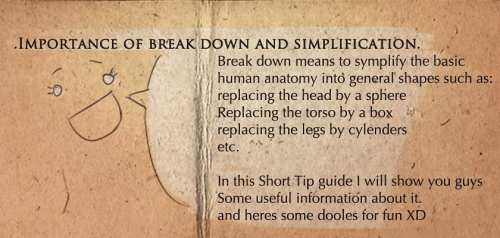
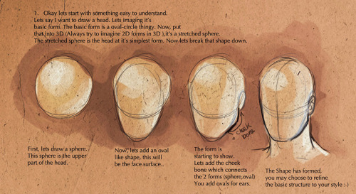
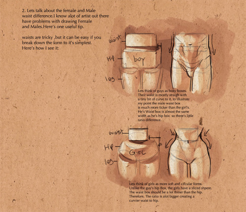
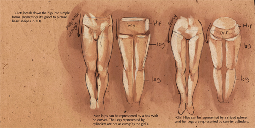

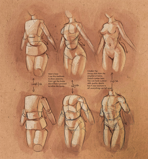
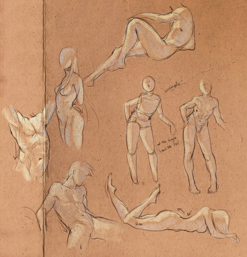


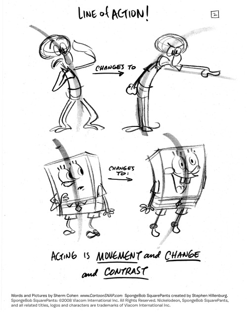

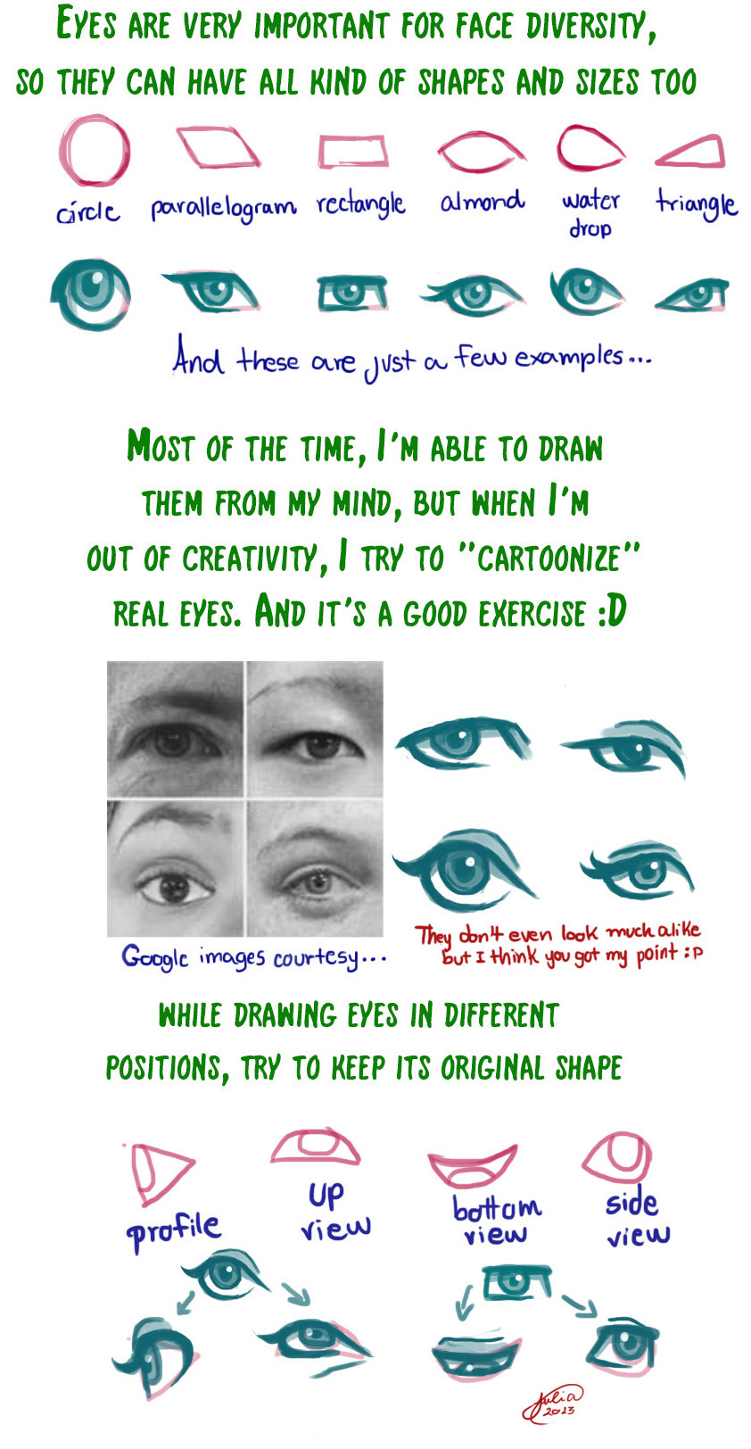
Notes on the importance of the line of action.
Sources: Flooby Nooby, Advanced Animation by Preston Blair, shermcohen, Pixelovely.com

This is all I need to remember. But I keep forgetting.
Shading Colour choice Tutorial by *cherubchan


Skin Tutorial by acidlullaby from DeviantArt
Also check out the rest of their Tutorial gallery section for more tutorials about skin!
Thanks to reflectuousechoes for telling us about this tutorial!

Hi, so I was practicing painting and decided to practice painting hair. This is what came out.
I was wondering if you could maybe help me with whatever is wrong with it? If there are any shading/painting tips or anything you could give or even the small bit of anatomy that’s in the picture. Anything would help, honestly. :D
Hey! I love the color scheme of the hair. Remember when anything has a pattern on it (like the subtle stripes of color in the hair) the color or pattern will bend to fit the form. Like how a striped shirt has curved lines even though the lines are printed straight- patterns adhere to the form.
Also remember to pin down a light source before you start painting! Right now I can’t tell where the light source is. Pick one and stick to it. It’ll make placing shades a lot easier.
The highlights and low lights of the hair all seem to be simply darker version of the base color. Try using opposite colors for the lights and darks. Most common lighting tends to have either yellow based light and purple based shadows, or orange light and blue shadows.Here’s a simple drawing to explain:

One more thing i suggest is drawing the rest of her body until it runs off the page. Since the hair goes past the cut off body it looks a little awkward.
I hope this helps!
-Fud
====
Hi, Qinni here,
Something you have to be careful of: even when you think there’s something covering certain parts of the body, it’s better for you to either visualize it already in your head so you know exactly where the head is under the hair (or where the hips are under the dress, etc), and if you can’t visualize it in your head, it’s better to draw it out completely, because there’s a big chance that people will feel there’s somthing wrong even if they don’t completely see it.
So the side of the head looks a little strange and the neck is not correctly connected in the right place to the head. here’s how the structure of the head should look under the hair:

perhaps this helps a little :)
- Qinni


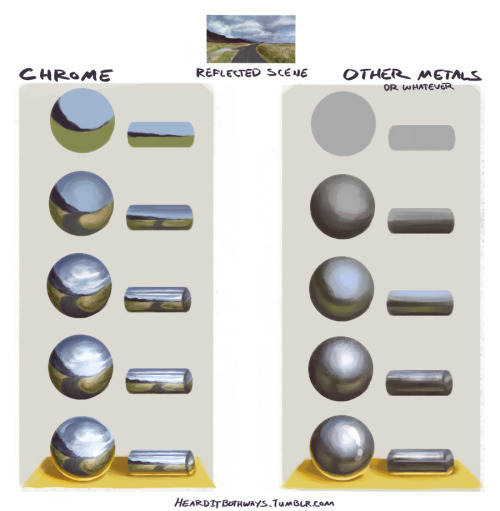
I am probably not the best person to be asking since I am still learning myself, so take this with a grain of salt. Your best bet is just to observe metal objects in real life or find references. But I hope this at least points you in the right direction!!

Here’s some tips, of course nothing professional, but things I’ve learned myself.
Hope it helps some of you guys. ovo
people ask me a lot about drawing poc, more specifically “how” to do it. my kneejerk reaction is to get frustrated by it, because the answer is “just like you’d draw anything else.” it’s like the main excuse artists and writers use to not include poc in their art and in their worlds — they “don’t know how,” implying that we somehow operate by a separate set of rules, that while white characters don’t require a special set of considerations to be varied and textured and interesting, non-white characters are just an elusive series of step-by-step instructions that most creators just can’t be assed to learn or to include
i still feel that way
but
i guess i can understand that most instructive media focuses specifically on white aesthetics, proportions, skintones, and features, so there really is a need for more instructive material that is more inclusive
i can dig it
that said, there is a lot that i don’t know and am not good at and i don’t really feel comfortable trying to instruct other artists, but i’m fine with taking you through my thought processes a little
SO here’s some stuff about skintones. it’s not perfect, and there will never be a better teacher than the world around you for showing you what things look like and how to express them
first off, if you’ve ever seen me stream you know i don’t usually block in my shading with hard lines like this. i like to paint and sample colors as i go, but i’m trying to communicate my ideas about color a little better
but i’ve always used the same basic process for coloring skintones, any skintones, forever and always:


this is going to change up a little bit with directional lighting, colored lighting, environmental lighting, shit like that, but this is your basic procedure. the biggest mistake i think artists make is using skintone+black for shadows and skintone + white for highlights, and that results in pretty dull looking skintones

in the former image, i only varied the value of the main skin color, but in the latter i also varied the hue and saturation. doing so gives you more of an opportunity to add warmth and depth to your colors, as well as bring in environmental colors if you need to
you want to sample around the palette, use reds and purples and oranges, don’t just stay within the range of your base tone!
this applies for all colors, not just skin, but especially skin! you want skin to look alive, not plastic and dull
these same rules apply for most skintones

though it’s always going to be incredibly helpful to just look at references of the skintone you’re trying to draw, for little details like (for example), very dark skin, because there is a more extreme light/dark variation, will often look much more reflective than very light skin under the same lighting conditions
like so
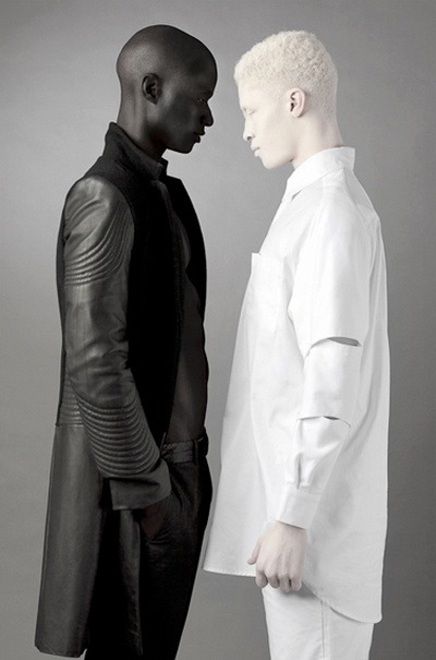
because of this, you’ll want to work on using light more than shadow to describe form on dark skin
again, this is true of all colors, but especially skin, because you don’t want skin to look flat and lifeless!
the same rules can apply to fantasy skin tones. start with a base tone, then use warm, saturated colors to add light and shadow. sampling around the palette becomes really important for fantasy skintones if you are trying to make them look realistic/believable

this is especially true if, for whatever reason, you wanted to make a character with grey skin that looks alive and believable

OKAY THAT’S THE END OF OUR SHOW


Some people have asked me for this tutorial too, I know that a few informations here are pretty obvious, but I just thought they were valid to include, and it can or cannot work for you, I just hope you find this helpful in someway :)
I’m sorry for any grammar mistake, and I don’t know how to say somethings in english, so I also hope I made myself understandable :P
Just some references, add your own
*Pose Maker
*Heads
*Poses
*Hands
*Colour Palettes and Patterns
*Skin Colours
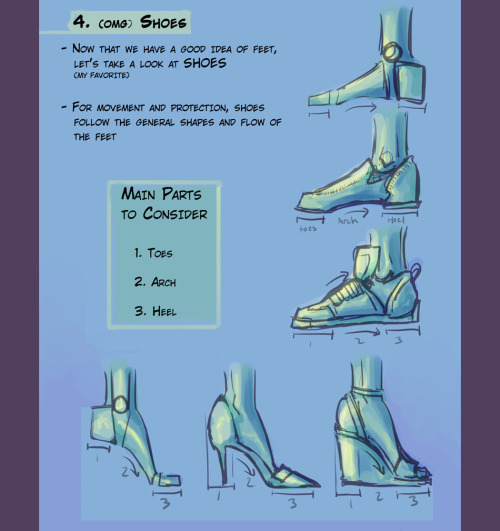
*How To Draw Hands
*How To Draw Cuts And Bruises
*How To Draw Fabric Folds/Creases
*How To Draw Noses
*How To Draw Lips
*How To Draw Hair
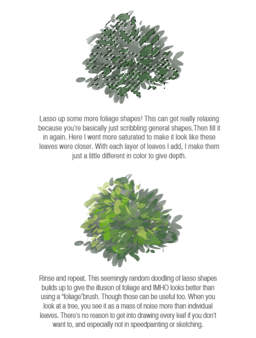
*How To Draw Photorealistic Foliage
*How To Draw Light And Shadow
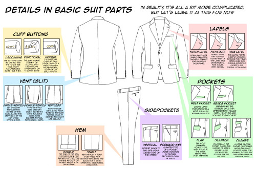
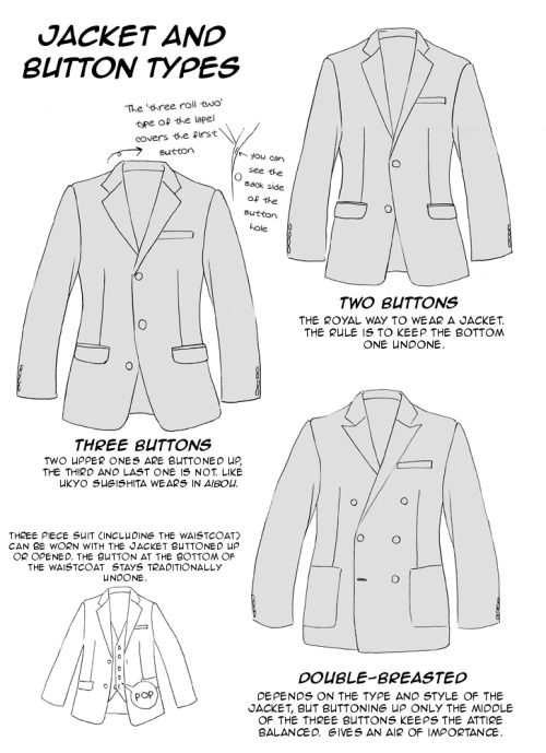
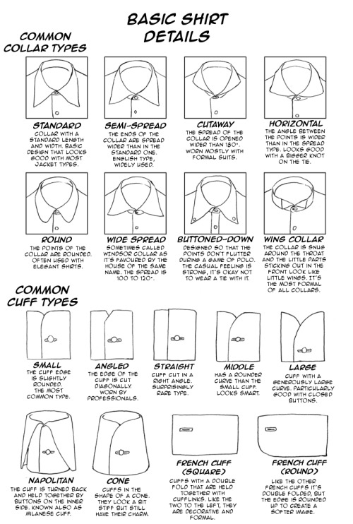
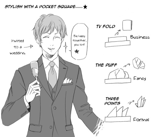
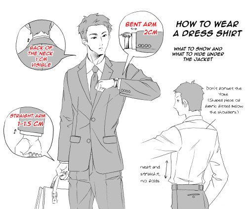
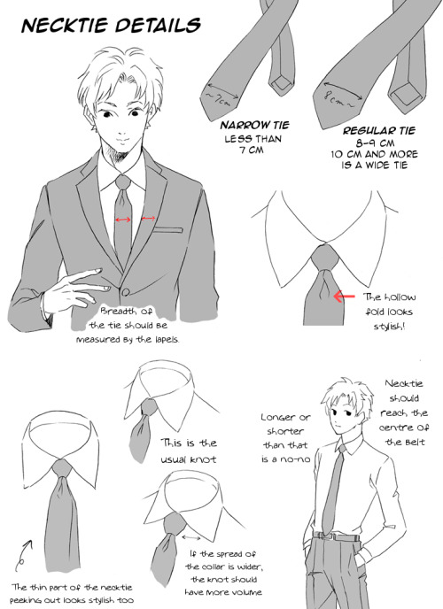
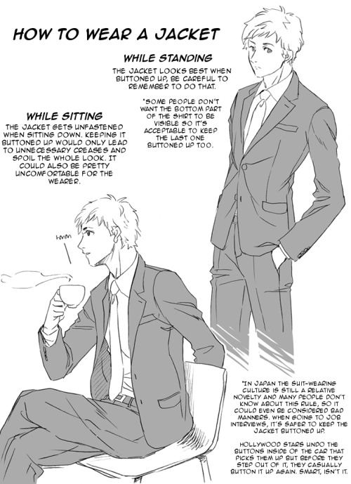
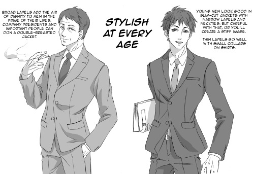
Clothing references
art-and-sterf:
All References Male Clothing Female Clothing
Genres High Fashion Steam Punk Goth Street Fantasy
Modern Vintage Historical
Shirts Blouses Vests Jackets Coats Cloaks Hoods Corsets
Pants Leggings Skirts
Accesories Bags Jewelry Necklaces Rings Fans Parasols Tiaras
![[x][x][x][x][x][x][x][x][x]](https://64.media.tumblr.com/2ccff787e0ea522f6032ce0c6fb2f1d9/tumblr_moww2zer491qfj4xgo1_540.jpg)
![[x][x][x][x][x][x][x][x][x]](https://64.media.tumblr.com/7afecbec41754b4917dbafee4990d8cf/tumblr_moww2zer491qfj4xgo2_500.jpg)
![[x][x][x][x][x][x][x][x][x]](https://64.media.tumblr.com/838da7a78394f770bf7e9472ad7395b1/tumblr_moww2zer491qfj4xgo3_1280.jpg)
![[x][x][x][x][x][x][x][x][x]](https://64.media.tumblr.com/7d6412a149d0e6a0ac22955f446fcdce/tumblr_moww2zer491qfj4xgo4_1280.jpg)
![[x][x][x][x][x][x][x][x][x]](https://64.media.tumblr.com/9f364fdfa465c767d53913eb27c8c70b/tumblr_moww2zer491qfj4xgo5_500.jpg)
![[x][x][x][x][x][x][x][x][x]](https://64.media.tumblr.com/84b076b1d29b73618f431255d69197d2/tumblr_moww2zer491qfj4xgo6_500.png)
![[x][x][x][x][x][x][x][x][x]](https://64.media.tumblr.com/1dc3910607a7ca34eeb7ea7056f3e133/tumblr_moww2zer491qfj4xgo7_500.jpg)
![[x][x][x][x][x][x][x][x][x]](https://64.media.tumblr.com/318be49cfba9596a3ce44e19108c42a9/tumblr_moww2zer491qfj4xgo8_500.jpg)
![[x][x][x][x][x][x][x][x][x]](https://64.media.tumblr.com/cd74221a11c6af80b5f6773ea660ac11/tumblr_moww2zer491qfj4xgo9_1280.jpg)
![[x][x][x][x][x][x][x][x][x]](https://64.media.tumblr.com/753a0bd2c8a915e26412c6a7d65e0404/tumblr_moww2zer491qfj4xgo10_1280.jpg)
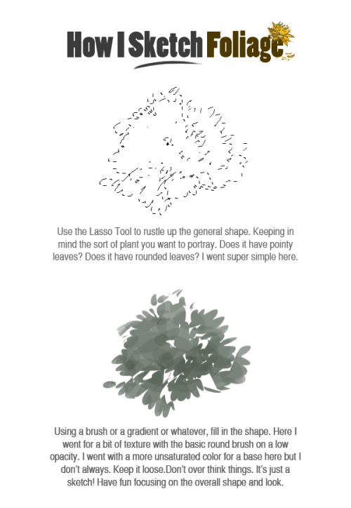

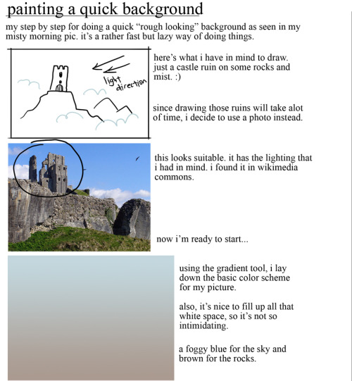
As promised forever ago, a quick visual breakdown of how I sketch with the lasso tool. Now you all know just how lazy I am lol..not really, I hate to demonize any tool. It’s just a super generic technique I’ve sort of become obsessed with. Making sketchy blobs look like things. — (On Deviantart)


