Anatomy Reference - Tumblr Posts - Page 2


Here’s an example of body motion and fluidity of movement :D featuring Roxas, of course.
Here’s the link to part 1 of 4 of Force drawing by Mike Mattesi that I found helped me immensely


My first shot at creating a sort of tutorial/guide, telling how I do things. On this initial chapter we’re going over the handy matter of Hands. Not meaning to be an encyclopedic explanation, only showing my own methods and self-taught clues. Hoping somebody finds it useful! :3 I’ll do more if this one is received well. So let me know~
My thanks also to the supporters in my Patreon campaign, who helped me decide which themes to focus on for a start. And are actually allowing this to happen. :D Cheers!
An Anatomy Tutorial

Heya sorry this took so long!! OK so just a disclaimer before I begin: I still have a LOT of room to improve as an artist, plus I actually don’t take the time to study anatomy very much myself lol so take my words with a grain of salt. My personal opinion is that when it comes to drawing, it’s more important to understand how to approach bodies + understand forms and proportions than it is to necessarily know anatomy, so this is a general guide on that I suppose (with some words along the way about my thought process when drawing).
First of all, I need to link you the single book that every artist needs ever: Figure Drawing for All It’s Worth by Andrew Loomis. PLEASE GET ANDREW LOOMIS’S BOOK ON FIGURE DRAWING this book taught me like everything!! It is the second image on this page; while you’re at it, you can grab his other books too. There are many other good books out there but I honestly can’t think of one that would be a better starting position than this one.
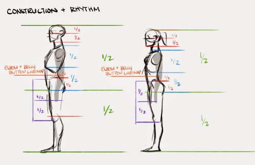
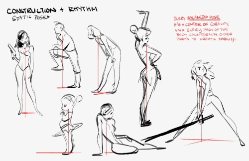
The most important thing to getting anatomy right is the proportions of the body. Even if you know and can draw all the individual muscles of the body, if the proportions are off, the entire body will look very off. You will find that even for very stylized bodies, they follow many of the basic proportions, which goes to show how important they are. Below is a quick demonstration with two different body types - you’ll see that the proportions apply to both. There are many more than these, but these are the primary proportion rules I personally keep in mind. (Note: Take #6 with a grain of salt because it’s just something I’ve generally observed myself, not an actual rule) [hi-res image]

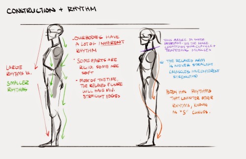
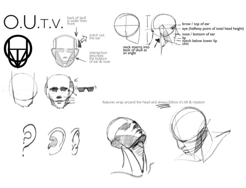
After you come to understand proportions of the body more, you can move on to constructing the body. A really important thing is to break the body down into a handful of basic solid forms, essentially simplifying them before you add details on top. A lot of people like to use stick figures or spheres and cylinders - personally I’m not a fan of either since they tend to lead to rather rigid bodies, so I like to use forms that are based off of a modified skeleton. The skeleton (devised by Loomis, by the way) is what I sort of keep in mind when I do the next step below this one. [hi-res]

When actually drawing sketches, I simplify the skeleton and draw the body with solid forms. The torso in particular can be kind of tricky - it’s easier to think of it like a flexible jellybean or a bean bag. Additionally, try to draw all of the body at once quickly, you’ll better capture the movement of the body as a whole and the pose will look more natural than if you were to start with details at one end. Below are some quick example sketches close to what I would usually start with. The general order that I draw a body in is: torso -> legs -> arms -> head. (Note: The vast majority of movement in a figure is carried in the body and legs; after that it pretty much doesn’t matter where you put the arms and head because they only change the general impression of the illustration a marginal amount.) [hi-res]

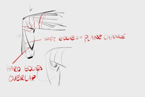
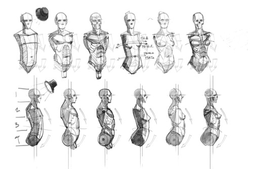
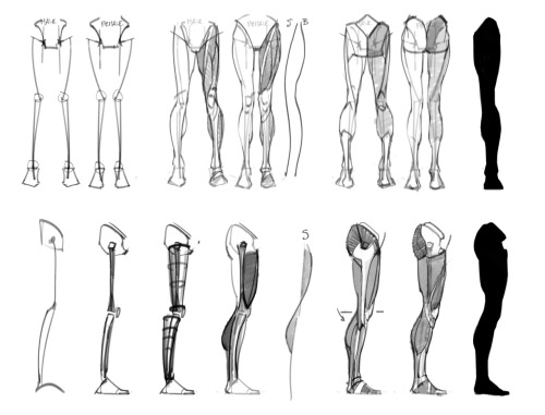
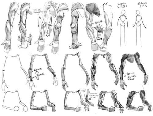
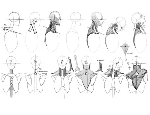
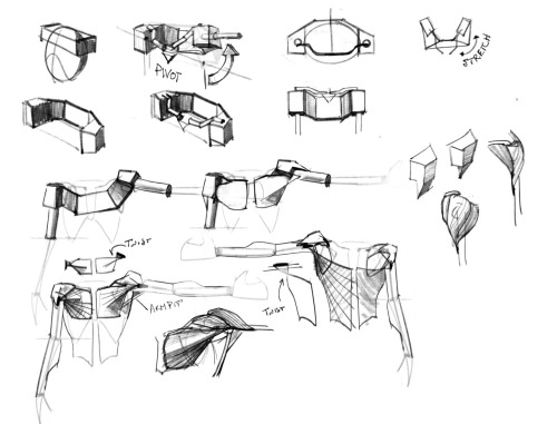
After this point I start to rough out the general shape of the body, getting the major muscles and forms. Think like a sculptor and get the main forms down, but leave the details for later. It’s only after that that you can start to add more details for the actual muscles of the body. Below are the main muscles and forms I think of, which probably aren’t accurate at all so you may want to consult an anatomy book lol. Even when it comes to muscles it’s important to think of them in terms of solid forms! Think of them as solid lumps or wedges that piece together. [hi-res]

It will probably take a while to get the hang of doing this, because in reality, even if you know to think of bodies in terms of proportioned solid forms, it will take much longer to train your mind’s eye to actually instinctively think that way. In a way, becoming better at drawing is more like becoming better at the way you imagine things in your head, rather than becoming better at drawing lines on the page. Additionally, besides just drawing these forms, it’s good to get out there and draw people from real life! Draw models, draw ordinary people on the street, draw everybody. All in all, it’s a long journey but it’s a very rewarding one!!
And I think this concludes my tutorial(?). Apologies for the length, to be completely honest this is a topic that I’ve wanted to talk about for a really really long time. A lot of stuff here took me years and years to realize (god forbid some of the old ways I used to start my sketches) and I hope I can maybe save someone out there all the trouble of figuring this stuff out! In summary, it’s all about learning the basic forms of the body, changing the way you think of drawing, and applying that to the paper.


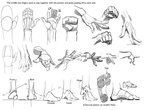
My first shot at creating a sort of tutorial/guide, telling how I do things. On this initial chapter we’re going over the handy matter of Hands. Not meaning to be an encyclopedic explanation, only showing my own methods and self-taught clues. Hoping somebody finds it useful! :3 I’ll do more if this one is received well. So let me know~
My thanks also to the supporters in my Patreon campaign, who helped me decide which themes to focus on for a start. And are actually allowing this to happen. :D Cheers!
Genice, can you give me some advice with hands? The hands i draw sometimes end stiff and ugly. Also hands in perspective, because sometimes they end too big or small. Thanks!
i mostly got better at drawing hands by just practicing how to draw them a lot!what i would do is draw a pose or two over and over again (maybe at slightly different angles and stuff) first with reference, and then draw them again without looking at anything to see how much i can draw from my mind, and then go back and forth between the two until i get enough of a “feel” to draw a certain pose decently without relying on reference. i think after a while you kind of develop patterns in the way you draw hands and from there it becomes easier to draw different hand poses and stuff from scratch
to make the hands you draw look less awkward/stiff, i think it helps to focus more on the overall flow of the composition and silhouette of the hand rather than getting all the details in and anatomy right and stuff in the initial stages


when drawing hands in perspective i think it helps to visualize them as 3d shapes

to get the foreshortening right (aside from using perspective guides and whatnot) i like to just draw the hand first, and then eyeball the perspective and adjust its size and position until it looks right

(select with lasso tool > ctrl+t to transform +right click for more transform options)

another thing i do is take reference pictures with my ipod (any camera works tbh. i just find using a mobile device to be more convenient)by holding the camera close to my hand i can get a really exaggerated perspective like this:

it’s nice because i can get the ref for the exact pose and angle i’m looking for without having to do a lot of internet fishing


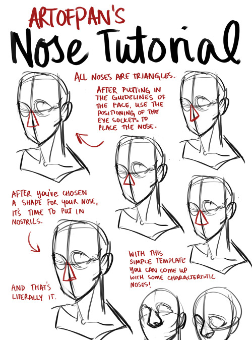


Whoo, super long nose tutorial! I’m sure there’s heaps I didn’t mention in this but this is generally how I approach it - the main thing is to check out references and try and draw different noses, it’ll help you create more diverse characters and have fun with it without being afraid of drawing the nose (since it’s genuinely one of my favourite things to draw).
Other tutorials: X
Some notes I put together for my CDA Class. Just stuff that I use. Take with grain of salt.


‘Anatomy Dump’ Artist: kakimari Links: Image 1 Image 2 Image 3 Image 4 Image 5
Tumblr


Some building block references my Life Drawing teacher drew up for us for our Figure Drawing class. Thought I would impart the wisdom.
hhhhh your art is so beautiful u v u. I'm wondering if you could do some references on backs? Of course only if you have time and feel like doing so o v o;;;


forgive my handwriting I HOPE THIS HELPS A LITTLE BC IM NOT RLY SURE IF IT MAKES SENSE also here are some pics of rl backs which you can also locate via google 1,2,3,4,5(nsfw bc butt)
fat bodies tutorial!
ALRIGHT SO my pal @kalreyno wanted help with drawing fat characters and as a fat artist i felt like i could give a bit of helpful insight on that. there’s also been a lot of complaining about “boo hoo fat characters are hard to draw so i can’t include them in my work Ever” goin on lately so if that’s your case then this is for you too!! and also just for anyone who would like help with fat bodies in general, ofc. anyway, let’s get this show on the road!!

let’s start with some common misconceptions. these are the two main attempts at chubby bodies i run into, so i’ll focus on them.
the Anime Chubby i see everywhere, and it’s just……so wrong in many ways. first of all, there is almost no additional body fat compared to your average thin character - except for where it’s added in “attractive” places (breasts, hips, thighs). the breasts are way too perky, and don’t have the realistic shape fat would give them (though how to draw accurate breasts is another tutorial all on its own lmao). there is still a thigh gap, which usually only happens in very thin people, and bones are still visible on the surface of the skin, which also rarely happens in fat people.
the Michelin Man is better in some ways, but still not that great. it’s a slightly better attempt, but basically all that’s done there is taking a thin character and blowing them up, while giving no thought to fat distribution. the thigh gap is usually still present, and they look a lot more hard than soft - and fat is very soft and pliable.
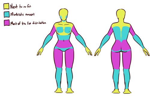
here’s a chart on how fat usually distributes (if you can’t read my messy writing, “1. next to no fat, 2. moderate amount, 3. most of the fat distribution”). basically, the more muscle an area has, the more prone it is to develop fat, such as the abdomen, thighs, and upper arms. it’s important to note that fat sits on top of muscle, and that it does distribute in different levels, and not evenly across the body as shown in the Michelin Man.
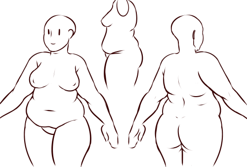
now, here’s an accurate fat body with all of that kept in mind!! notice how the fat isn’t only kept to aesthetically pleasing areas, and how it sits realistically on the character’s body. their breasts sag a lot more, which happens even in thin people with larger breasts, and the nipples are pointing more downwards than straight out. there is no thigh gap in sight, there are no bones in sight, and most importantly, they have fat rolls, which are very important in drawing a convincing fat character!! as far as i know i’ve never met a single person with no rolls at all, and everyone has them, whether thin or fat - they’re just more prominent and more consistently present in fat people. pay close attention to where they are and how they’re shaped.

here are a couple of drawings showing how fat is affected when sitting vs stretching. as seen in the first, the fat specifically on the stomach is distributed a lot more evenly and stretched out, so it becomes “flatter”. the love handles are still pretty visible, though, as well as the fat on the thighs and arms. the breasts are raised with the shoulders, and the fat on the shoulders and near the neck forms rolls as it’s being pushed together.
in the second, there is a lot less room for distribution, so the fat is all pushed together. the breasts sag and the stomach forms rolls and spills into the lap. a good analogy for the way fat works is to liken it to a water balloon, and thinking of how its shape would change when resting flat on a surface, hanging off of a ledge, held upright, etc.

here are a few extra tips i find a lot of people miss!
first on the top is the hip/pubic region. the first circle is showing the way the bellybutton is folded in fat people, as opposed to stretched out in thinner people. the second is the stomach fat spilling over onto the pubic region and creating a separation in the two areas, which is something that’s missing in a lot of art. in addition, the pubic mound also gains fat, making it round as seen in the profile drawing i did up there (i’ve heard people refer to it as fupa?). the last in the hip region is the lack of a thigh gap. i can’t stress this enough!!!! if you’re trying to draw a convincing fat character, make sure their thighs are pretty much always touching!! for reference, mine literally don’t separate until my feet are about 2ft from each other.
the bottom right is showing the double chin, which a lot of people are afraid to draw!! fat does distribute itself here too, and there’s nothing wrong with it, so don’t feel like you shouldn’t give fat characters a double chin in your work for fear of it looking like a caricature.
in the bottom middle, it’s showing how fat affects different types of breasts with the presence of more or less breast tissue.
lastly, at the very right are stretch marks with their usual locations and directions, which i also can’t stress enough!!!!! i sometimes forget to add them honestly, but they’re so important in accurately portraying fat characters, as they literally come from the skin being stretched from fat being gained (and they’re also just rlly neat lookin like why wouldn’t you lmao). some people have less and some people have more, feel free to experiment with them!

the last thing is body types!! there isn’t one single way for a person to be fat, so feel free to experiment with shapes once you’ve learned the basics!!
so there you have it, a tutorial on how to draw chubs!! now go forth and make some accurate fanart or some rad fat characters, because the world could always use more of both. hmu if you have any questions or concerns, and thanks for reading!!
EDIT: someone pointed out the bad wording in the tutorial. thank you for bringing it to my attention and sorry for offending anybody. i’ve updated the tut, so please reblog this one!