262 posts
Chikasartrefblog - Chika's Art Ref Blog - Tumblr Blog

How to show expression with the mouth!
This was a request and at first I wasn’t sure if I had anything to provide with, but as it turn out it got a little longer than I expected because there were actually things I had to say!! Wow!!
Anyway, this is some guidelines I follow when I try to make the face expressfull, more specifically the mouth! It is often neglected, since it’s actually pretty hard, I’ll admit. But I’m here to help (hopefully…)! A mouth expression tutorial as per request. Enjoy and hopefully it will help some a little. ʕ•ᴥ•ʔ
Draw the teeth at the right angle.
This is super important. The upper jaw follows the angle of the head, and the lower jaw will depend on how open it is. Make sure you have a rough estimate of where the teeth are, and how much of them you’re going to see!
The lips will VERY roughly follow the same angle as the teeth. It really depends on the character, but it gives you a sense at least.

If you DON’T do this, you’re going to lose so much volume and the mouth is going to end up looking unrelatable. I showed this example in this tutorial:

It’s not just the lips!
The cheeks, chin, and tongue play a role too!

Try look at your own mouth or references! I have a very pliable and large mouth, so that’s one reason why my characters have it too lmao.
ASYMMETRYYYYY (ง ͠° ͟ل͜ ͡°)ง
I cannot emphasize how important asymmetry is when drawing expressions. It applies not only to the eyebrows to achieve the Dreamwork Face™, but also the mouth. Seriously if you draw a symmetric mouth I will deliver myself to your mailbox and then shout at you until you fix it.
Look at the difference between these two for example: which one has more “life”?

I think you get the idea.
Push and squish - give it flow
Here’s an old drawing I have but it illustrates how I think when I squish the mouth, and use folding and wrinkles to my advantage.

Look at your own face and see where skin bundles up, where it creases the most and when bumps appear on your chin. Subtle details makes all the difference!
One VERY effective detail is illustrated in the first sketch, where I pull upwards on one side, and downwards on the other. That’s a good detail to use when the character is making a skewed expression, or is extremely frustrated. I encourage you to play around with that concept bc it’s ~super effective~!
EXAMPLES:
Happy: Your entire mouth is pushed upwards, not just the corners of your mouth!

I tend to draw a :3 mouth bc I’ve been drawing Lance too much….. You don’t have to but it’s basically imprinted in my motor memory by now.
Pouting/frowning: corners are pushed down, middle pushed slightly up. Sometimes, there’s a slight dip in the middle too. It can give a sense that the character is biting their lips.

Showing frustration/intimidating/is intimidated: basically showing a lot of teeth. The corners are as open as possible and the middle sorta more squished. An extremely important detail here is showing some of the gums, and open space between the cheeks and teeth. That way it looks like the mouth it open to it’s full potential. Here is also where you basically MUST add folds and bumps, or else it’s not going to look relatable.

(Here I am again with the pulling upwards on one side and downwards on the other, as illustrated on the last sketch)
And then again, here’s just another doodle showing how important it is to show the gums. It’s the same face twice, but the second one looks slightly more frustrated doesn’t it?

(from my other tutorial on how to draw facial expressions)
As you can see, this last one is very versatile and I draw it a lot. Play around with the basic shape and see how much subtle details makes a lot of difference!
That’s it!
I hope that cleared some things up and was somewhat helpful! Enjoy drawing ✨
I jotted down for a friend of mine some tips and notes on how I approach drawing hair, and things I keep in mind while doing so, and thought I’d share. There are loads of other ways to do it, and the learning never stops, so I hope this helps!


Other things to consider
You don’t always have to draw the harsh light line if you just want a soft scene. You can just use the ‘bounce'as the light source.
You can also transform the harsh light line layer to any layer mode options your art program allows.
Feel free to experiment. Also, it takes time and experience to learn the quantities of line thickness, opacity you want of your light layers. So if you find yourself getting frustrated that your work looks nothing like mine don’t worry you’ll get there :)
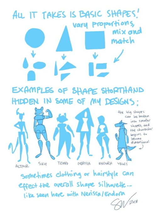
Character Design Tips
Some people have asked how I went about drawing the Overwatch cast, so I threw together a list of things I think about when designing characters: shapes, silhouettes, colors, and inspiration.
1. Shapes
There are three basic shapes in my toolbox: round, box, and triangle. If I follow my intuition, each shape conveys a personality. For example:
Round = charismatic, harmless, endearing
Box = reliable, uniform, traditional
Triangle = cunning, dynamic, competent (downward pointing more aggressive)
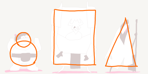
Shapes can also be combined for more complex characters
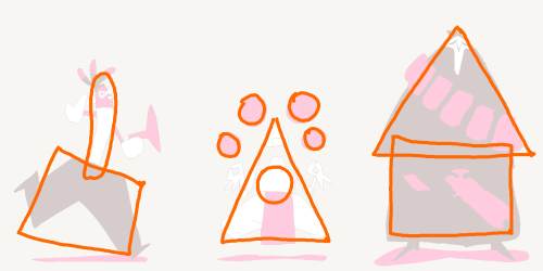
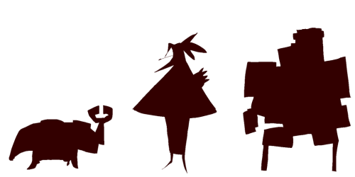
2. Silhouettes
Block in the character. If I can still recognize who it is, then it has a strong, readable silhouette.
3. Color
Sometimes less is more. Limit the palette for unity and impact. When working with three colors, keep the 60-30-10 rule in mind. Pick one color to make up about 60% of the character, a second color to make up about 30%, and the last color is about 10%.
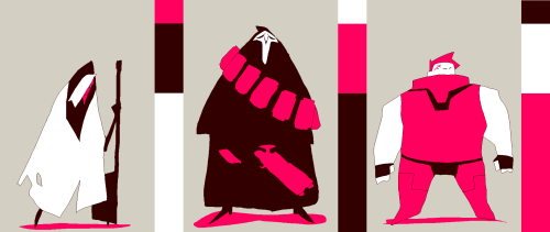
When working with just two colors, use the 70-30 rule. One color is about 70%, the second is about 30%.
4. Inspiration
Designs come to mind easier when I’m listening to music, or when I have a mental image of something in mind. For example, I was listening to Klezmer music when drawing Reaper, and I was thinking of a chicken when I was drawing Lucio. It can take a while to warm up, so a good source of inspiration is important to stay motivated.
Beyond that, it’s up to you!
[If you want to see the specific artists I drew influence from, click here to see my influence map.]
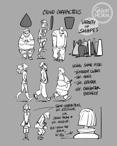
Tuesday Tips- Crowd Characters — When I need to fill a crowd with characters, I usually try to pick a few simple shapes and use those to build a series a characters to complete the scene. I may switch it up by adding a hat, glasses, switching gender, or a slight difference in posing. In essence, the goal is create a variety of characters without spending too much time on each one. That’s why repeating shapes or even entire characters saves a tremendous amount of time. -Norm

at last, a sorta tutorial!
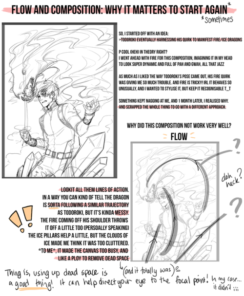
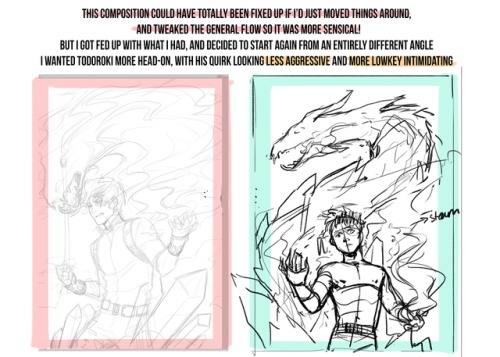
This is honestly a very loose, general rule of thumb when you’re considering how to put together a drawing - take everything I’ve said with a grain of salt (and a dash of your own experience), because composition and flow is super subjective
this is just some shared personal tips based on my own learning - but I hope it helps anybody who might be struggling n_n

Head rotation tips - recorded a demo for my upcoming Intro to 2D Animation Tutorial Package. I talk about flipping, tracking techniques and utilizing arcs to maintain solid drawing.
Animation Process Part 1: Thumbnailing, Keys, and Extremes
A week or so ago I finally finished this little dance animation that I’ve been chipping away at in my spare time! In the end it took me about 45 hours over the course of 8 months.
I documented each stage of the process in gifs and wanted to share in order to give anyone just starting out an insight into my workflow and how I break a complex motion into digestible, accomplish-able chunks so that I don’t get overwhelmed by the amount of work that’s ahead.
In this first part I’m going explain a little bit of my approach to thumbnailing. The great thing about this part of the hand drawn animation process is that I would approach it the same way in ANY piece of software. This stage is just about drawing and timing. Even the lowest tier programs can do that. It’s not until the cleanup stage that any of the bells and whistles matter.

The Research Stuff
Before starting any drawings I like to search around youtube for inspiration; especially if it’s an action I’m not entirely familiar with. I had just watched the webseries The Earliest Show in which Lauren Lapkus and Ben Schwartz do a lot of really great dancing, so I studied a couple of those frame by frame. I also looked at some swing dancing competition videos to get a feel for the basic steps.
https://youtu.be/plOMomN9F5g?t=25m25s
For stuff like dancing or even playing an instrument I’m not familiar with I like to sometimes look up a couple beginners’ tutorials just to get some ideas for how to approach the movement.
This isn’t days of research. It’s just half an hour to an hour to get a feel for what you want to accomplish. Anything more than that and it can easily turn into procrastination.
The Drawing Stuff
Once I’m satisfied with my research I begin the thumbnailing process. As you can see, my drawings at this point are only slightly more detailed than a stick figure. I’m not worried at all about mass, I’m just trying to nail down some simple, clear poses.
The Animation Stuff
In order to not be overwhelmed by everything I like to approach scenes in a very systematic way. I’d say 90% of the animation I do is Pose to Pose meaning that I break actions up into 4 different types of drawings
Keys: The main storytelling poses. If the story of the shot is “Man hears news and is disappointed” then you only have two keys to do - the man hearing the news, and the man being disappointed. I’m not thinking about how he’s going to get from pose to pose at this point, I’m just thinking “What’s the best drawing to show that this man is really disappointed”.
Extremes: These are all the poses that have to be there in order for the action to work. If someone is walking across the room it’s every drawing where their feet make contact with the ground. If someone’s jumping in the air it’s the anticipation down and the highest point of their arc. The way I think of them is that they’re the furthest up, down, left, and right the character is going to go as well as any drawing where they make contact.
Breakdowns: These are the poses that establish or reinforce the physics behind the motion. If an arm is swinging forward and the hand drags behind this is the drawing that shows that. When a character does a high kick and puts the entire weight of their body into it this is the drawing that shows the hips shoving forward as the foot just starts to lift from the ground.
Inbetweens: The drawings that smooth out and polish the movement. Here I’m focused solely on the spacing of the drawings. Is it slowing out or slowing in? How far do I want to favor one way or the other? What’s the shape of the path of action? Are the drawings following a nice arc?
This is one of many ways to categorize the drawings. I’ve seen a lot of people who combine extremes into their keys phase, and others who combine extremes into their breakdown phase, and others still who do breakdowns while they’re inbetweening. This is just what works for me.
(For a more thorough explanation of Keys, Extremes, Breakdowns, and Inbetweens see pages 64-68 of Richard Williams’ The Animator’s Survival Kit)
For the thumbnails I’m only focusing on the Keys and the Extremes.
First I do the keys which for the first dance involve these four drawings:

As you can see there’s no thought about the weight of the movement. That’s fine. I’m just establishing how he’s going to hit each accent.
From there we go to the Extremes

Here I start to add a little bit of weight to it. The main things the extremes (in green) are establishing is the foot pattern. How is he passing his weight from one leg to the other?
With the torso I wanted to loosen it up a little bit. If you look at the keys they all have a really similar line of action. I reversed the line of action for the extremes which adds more change of shape and helps it feel more lively - even at this early stage

The arms are just establishing the passing positions of the arm swing. They’re fairly straightforward.
If you notice, these extremes have a lot of qualities of breakdowns in them. If I had to label them more precisely I’d say that what I’m calling the extremes are the contact drawings of the legs combined with the passing positions (breakdowns) of the upper body. I call them extremes instead of breakdowns because the legs are the most important part of these drawings and I wouldn’t consider those legs broken down at all; they’re just contact drawings. These hybrid drawings are the reason that so many animators categorize drawings differently. At the end of the day it doesn’t matter what you call any of this stuff as long as it makes sense to you and the end result looks good.
The Technical Stuff
At this point the entire animation is just a rough drawing on one layer. I would do this exactly the same in Harmony, Flash, Photoshop, or TV Paint. As long as you have drawing tools and a timeline you can thumbnail out animation like this

Extra Pro tip: It’s really helpful at this stage to establish some kind of basic ground plane or perspective - even if it’s just a character dancing in a void. This really helped keep the 3 Dimensional space in mind while planning his footwork. It also reminded me to have the character lean a little forward and backward in Z space as he’s moving. It’s easy to forget that kind of stuff when a character’s facing camera. Without it the animation will always feel a little flat.
That’s it for my thumbnailing process! If you found it helpful check out the next posts in the series! Part 2: Rough Keys/Extremes and the Shift and Trace Technique
some little notes i wrote out last night regarding shape language and how it informs my design choices. shapes are rad
Hello! I'm a self taught artist who wants to get better at shading/lighting and backgrounds especially. But whenever I try to do a background study, I can't break it down and it ends up looking terrible. Do you know of anything that would help?

Hi! I would like to talk a little bit of the thought process behind photo study and the importance of simplicity.

It is really important to break down an image to chunks of value rather than seeing the detail first, which can lead to over-complicated mush of colors with no constructed value.
These are some of the artists that inspired me to get used to breaking down images in the most simplest way possible:

Notice how super simple and straight-on-point his thumbs are? And this is how his colorscript for Moana looks like:


Zero detail. Yet you have all the information you need!
I personally think these thumb studies are super important to train your eyes to break down an image in values and colors and therefore be able to organize and design your painting better.
How I draw kisses!
A quick tutorial/cheat sheet on how I draw kisses!! I’m going to assume you already know how to draw a head and how to angle it, because that’s an entire procedure in itself. I’m going to focus on mainly the lips and also try and tackle some common mistakes when you’re first starting out.
Pursing the lips

So this is boring but crucial. If you don’t purse, their is no real kiss (take notes) bc placing your lips on top of someone else’s is not how you kiss… The most important part are the corners of the mouth, especially from the side view, because that’s what changes the most.
The actual kissing yeee
Let’s start do a basic side view kiss on the lips. And believe it or not, I think this one is the hardest!

Think about which parts of the face are going to be in front of the other! This can take some time to get the hang of, but once you get that down it’s easy. Also, focus on getting the heads at the right distance and angle. A common mistake is drawing them too close.
The Lightning Shape:

Still keeping in mind which part of the line is “Red’s” upper lip and which part is “Blue’s” lower lip, play around with the shape of the lightning. Very subtle changes can have a very strong impact! I usually go by feel, so take your time, but here are some things to look out for:

Details squishing etc.
So yeah once the lightning shape looks good, I usually add details and squish parts of the face that will touch. Which usually includes the noses, but from this angle they won’t squish unless you intend on making nice big noses <3. By now it should look something like this:

You don’t have to add the corners of the mouth! I usually do when I want to show that the character is smiling.
One technique used a lot in anime/manga + other cartoony art styles, is fading lines where two soft-ish objects press hard against each other. The picture above explains it.
Common mistakes
Getting down the crucial kissing part of fanart is hard and you will mess upp SO MANY TIIIIIIMES, but you learn from your mistakes, so don’t be discouraged. There are some things though that I frequently see when people draw kisses that makes it look awkward and stale, many of which I used to do myself. Here are some examples:

Try your best to avoid these. Most of the mistakes have little to do with the lips and more to do with the angle of the head. So getting that down before you move on to the lips is important.
¾ view Kissing
There are not a lot of angles where you actually see the lips meet (or at least not that I can draw…). Depending on how the heads are placed in relation to each other, you may or may not see the lips in a ¾ view. The way I have demonstrated is done in a way that the nose will bump into the other’s upper cheek.

Aaand that’s about it! These things will make more and more sense the more you draw them. At first it can seem very hard with so many things to keep track of, and it is, but practice makes perfect!
Rule of thumb: does the angle and position of the heads make sense? How are the lips going to align? What parts of the face are going to be in front of the other? How much will the lips purse? And finally, what is going to squish?
Thank you for reading! 😘

(☞゚∀゚)☞ now draw kisses
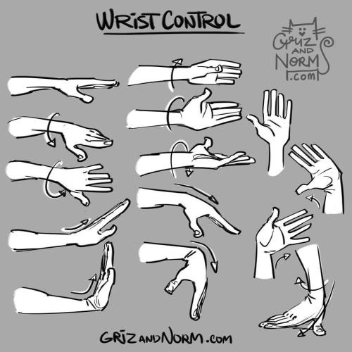
Tuesday Tip - Wrist Control An expressive hand gesture can be the exclamation point to a nice pose or gesture. We tend to forget how much mobility can be achieved through the wrist. Here’s a reminder of a few different ways the wrist can bend and twist, allowing for even more expressive poses. -norm #tuesdaytips #grizandnorm #norm #wristcontrol


Storyboarding Trick?
In storyboards you can’t animate out everything but for a demo reel or a short motion where you want the movements to ‘flow’ better there is a certain trick you can try on programs on Storyboard Pro or Photoshop.
Lets start with this:
This is just a rough board snippet of a guy punching air. It feels kind of choppy. It is made up of 8 unique drawings.

But if you take a drawing of the punching guy and using the select tool you transform skew/translate/rotate/ certain parts of his body you can get this:
And the timeline looks like this:

But I didnt draw any more unique drawings because I just slightly modified the existing 8 unique drawings. Transform an arm slightly and that is enough to fool the brain into bridging that big gap between two animation frames. Even moving the arm slightly down like in the picture below is enough to get this effect.

In Photoshop just use the lasso tool and transform the selection but the vector drawings on SB Pro make this a lot easier.
***For actual production work I would not try this because boards are always scrapped or changed and trying this can lead to frustration down the pipeline during the revision stage.
If you want to try this out just for fun or for your portfolio demo reel I highly suggest trying it out since if done just right they can really make your boards flow better panel to panel. Have fun!
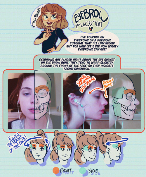
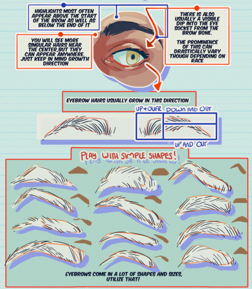

Hey friends!
Meg here for today’s TUTOR TUES-WEEK! Today we’re taking a look at eyebrows/eyebrow placement! I’ve covered more about expressions here! If you have any tutorials you’d like to see send ‘em in here or my personal! Have fun, keep practicing, and I’ll see you soon!

Tuesday Tips - Half and Half A technique I apply to help me draw the torso/hips area as well as the face. Splitting it in half helps me compare the width of mirrored features on the the other half. Also very useful when the body twists and folds on itself. Norm #grizandnorm #tuesdaytips #100tuesdaytips #halfandhalf
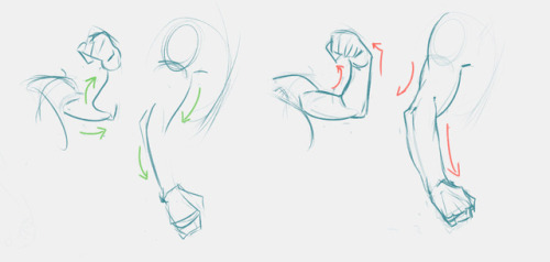
Ahaha Someone asked me for some tips on how I draw simple muscles. Unfortunately, my inbox glitched on me again and that message was no where to be seen. I apologize to that person who sent me it and, hopefully, I can make it up to you with this.
This is a short and simple tutorial.
I just use basic shapes that goes well together. Mainly, these two shapes, oblong and square, when I draw big characters.

The arm muscles are basically like big curves to me.
Apply this with a line of action and this is what you get.

Your muscles don’t necessarily have to be big. They could be slim, long, round and etc. This could also work really well if you have the basic anatomy down, but don’t stress about it. Just simplify them as much as you can without stressing over perfect details.


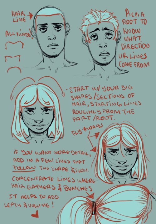
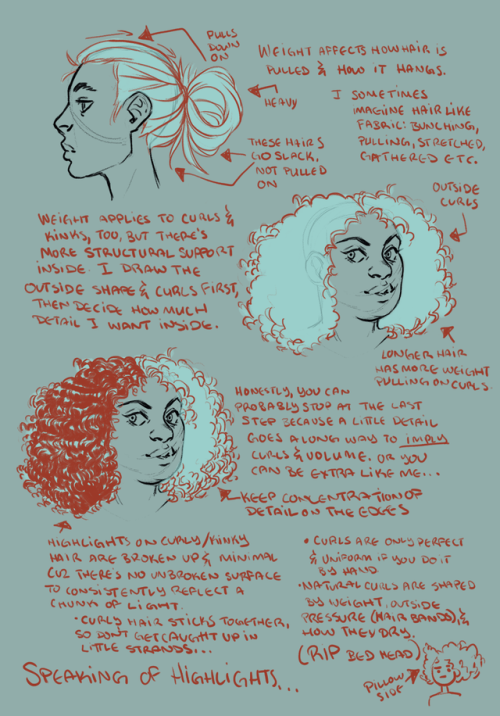
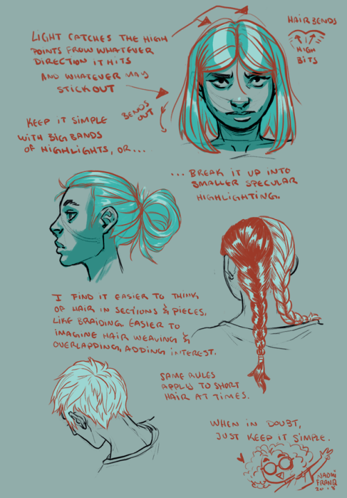
Hey, friends!
It’s Meg for today’s TUTOR TUESDAY! Today we’re going to have some fun with hair! Don’t hesitate to send in a tutorial recommendation either here or to my personal blog for next week! Keep practicing, have fun, and I’ll see you next Tuesday!