Composition - Tumblr Posts

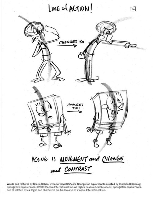
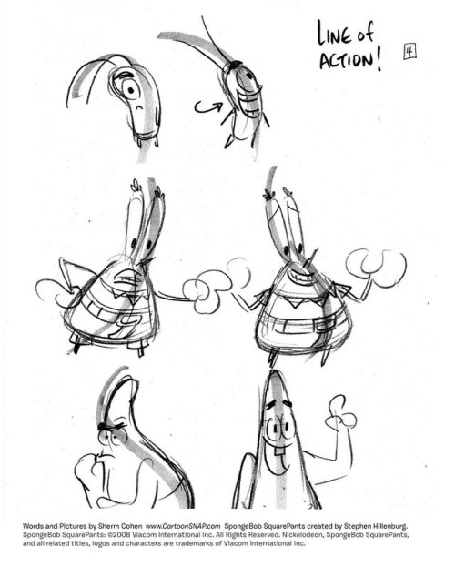
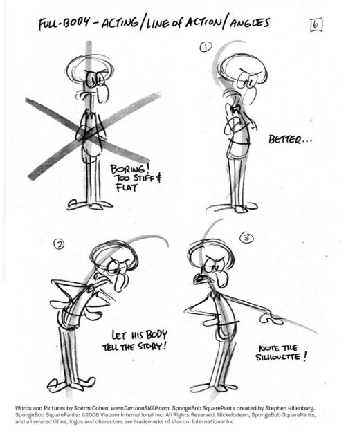
Tuesday Tips — Head Space — As an audience, our eyes are mostly tracking the head (and eyes) of the main characters on screen. As filmmakers, it would be a great disservice to not take that info into consideration. For clarity, try to make space around the head of characters on-screens. Too much visual noise around the face interferes with the message, unless that’s the point you’re trying to make make. Also, try your best to maintain the same head screen position when cutting to a new shot with the same characters, whatever type of shot it is. I know how simple this sounds but it’s very easy to forget if you’re not paying attention. -Norm @grizandnorm.com #tuesdaytips #100tuesdaytips #100tuesdaytipsbook #arttips #arttutorial #storyboard #grizandnorm

Happy Tuesday!
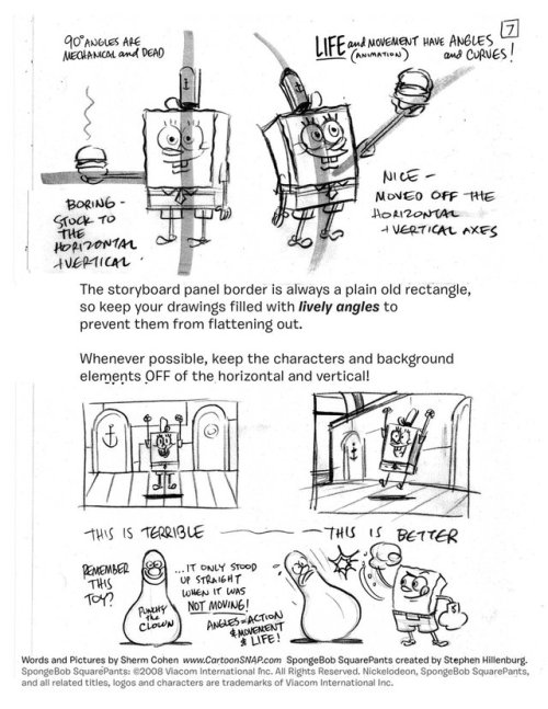
Cropping can be tricky. I use a very simple trick of cropping things at 2/3 or ¾. I avoid cropping at any joint or edge to avoid the illusion of something is missing or uncomfortable.
#griz #grizandnorm #grizandnormtuesdaytips #arttips #drawingtips #cropping
I know you probably get these asks a lot, but I've really been trying to try drawing comic pages. I really admire how free and flowing your style is! I've seen your little tutorials and tips and idk what's wrong but I just can't seem to wrap my head around panel composition? Like I do wonderful painting comps, but I can't seem to break out. Do you have any resources or help to get started?
thank you very much!!!!! im just using this ask as an excuse to draw random comic tips i hope thats okay and that you’ll get something out of it
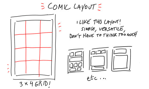

did that help…
technical question - you probably get this a lot do you have any tips on coming up with a whole scene including the environment?</3 and what's your technique? you're litterally so skilledj
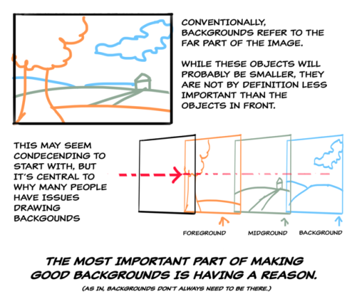
Yo thank you!! I was trying to come up with an answer and then I re-read ur question and I realised u said ‘including the environment’. When I think ‘whole scene’ I usually think that means a big ol environment with a tiny person slapped in the scenery somewhere. So I apologise if this turns out a completely useless answer djdjdjdjdjd
I did a little flow chart of how I usually do thumbnails and how much adjusting they go thru before I commit to a painting

I first try to find colours I like and the I just slap on the canvas what I have in my mind if I don’t have a reference (eg. Blue mountains, foothills, lake, and grass in the foreground). It looks shit so I start adjusting to make the picture flow. Usually for me that’s decided by angling the picture to make u look where I want u to (eg, the middle of the painting down at the water)
After that the picture usually still looks flat so I try to force the angle a bit more. Alas, warping. Then I reframe the picture again before adjusting the colours
When I’m thumbnailing and trying to come up with a scene the small details and the character are an after thought. I plonk them in to compliment the scene. Again usually that’s decided for me by how things flow together, the angles and the lines (eg, trying to make sure the little person doesn’t look decapitated by the line of the mountains)
Do you have any advice for flat looking art? everything i draw looks so 2D, and when i try shading it never looks right 😭
I don’t know if this helps at all, but I went with a landscape approach -
Things you can use for any drawing that will help:
- Blurring out FG and BG elements, or really any element that you don’t need to have focus on. So I wanted the eye to see the MG elements rather than the FG or BG, so I blurred them out.
- Darker tones in the FG and lighter the farther you recede.
- Heavier and thicker lines in the FG and thinner the farther you recede.
- Varying the sizes and placement of elements on the ground planes, and varying the heights and undulations of ground planes.
There are many many tutorials online for shading, depth, lighting and composition. I’m sorry I didn’t have more time to make a more in-depth one!


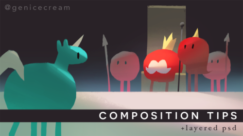
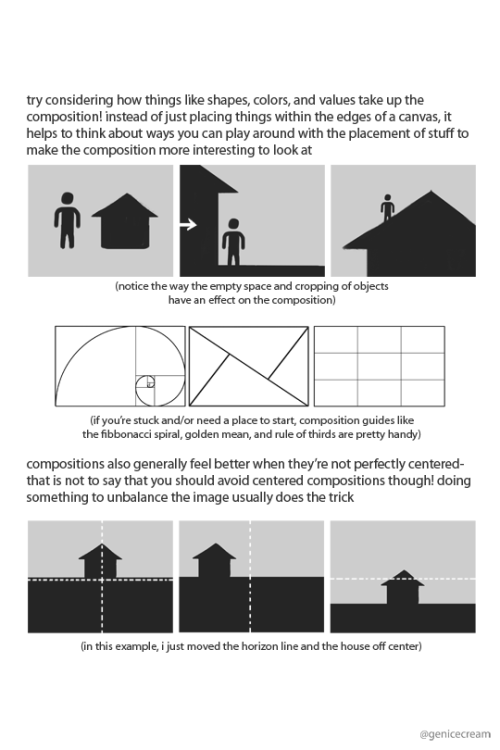
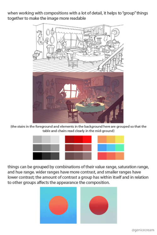
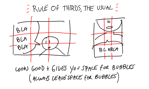
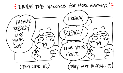
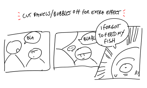
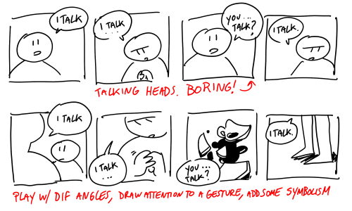
a series of composition tips i’d been sharing on twitter!
and since some people had asked, i’ve put up a pdf version of this on gumroad along with a layered psd of one of the example images too
tips would be really appreciated, but it’s up for free!

Just THREE DAYS LEFT to bid on the ULTIMATE COLLECTORS EDITION ONE-OFF SET of How to THINK when you DRAW books, each book with an ORIGINAL FULLY INKED SIGNED ILLUSTRATION! AND an ORIGINAL PIECE OF STRANSKI ART, only on EBAY HERE RIGHT NOW!
THIS IS YOUR ONE CHANCE to get this ULTIMATE PRIZE for yourself, or as the BEST CHRISTMAS PRESENT EVER for that Etherington Brothers fan in your life! Check out the auction RIGHT HERE!
PLUS! I have TONS of DIFFERENT tutorials, tips and references that I DON’T post here on the blog going up on OUR MASSIVE INSTAGRAM and over on OUR GIANT TWITTER throughout the day today and EVERY DAY
Lorenzo!


Drawing from films
Drawing from films is a ridiculously useful exercise. It’s not enough to watch films; it’s not enough to look at someone else’s drawings from films. If you want to be in story, there’s no excuse for not doing this.
The way this works: you draw tons of tiny little panels, tiny enough that you won’t be tempted to fuss about drawing details. You put on a movie - I recommend Raiders, E.T., or Jaws… but honestly if there’s some other movie you love enough to freeze frame the shit out of, do what works for you. It’s good to do this with a movie you already know by heart.
Hit play. Every time there’s a cut, you hit pause, draw the frame, and hit play til it cuts again. If there’s a pan or camera move, draw the first and last frames.
Note on movies: Spielberg is great for this because he’s both evocative and efficient. Michael Bay is good at what he does, but part of what he does is cut so often that you will be sorry you picked his movie to draw from. Haneke is magnificent at what he does, but cuts so little that you will wind up with three drawings of a chair. Peter Jackson… he’s great, but not efficient. If you love a Spielberg movie enough to spend a month with it, do yourself a favor and use Spielberg.
What to look for:
Foreground, middle ground, background: where is the character? What is the point of the shot? What is it showing? What’s being used as a framing device? How does that help tie this shot into the geography of the scene? Is the background flat, or a location that lends itself to depth?
Composition: How is the frame divided? What takes up most of the space? How are the angles and lines in the shot leading your eye?
Reusing setups, economy: Does the film keep coming back to the same shot? The way liveaction works, that means they set up the camera and filmed one long take from that angle. Sometimes this includes a camera move, recomposing one long take into what look like separate shots. If you pay attention, you can catch them.
Camera position, angle, height: Is the camera fixed at shoulder height? Eye height? Sitting on the floor? Angled up? Down? Is it shooting straight on towards a wall, or at an angle? Does it favor the floor or the ceiling?
Lenses: wide-angle lens or long lens? Basic rule of thumb: If the character is large in frame and you can still see plenty of their surroundings, the lens is wide and the character is very close to camera. If the character’s surroundings seem to dwarf them, the lens is long (zoomed in).
Lighting: Notice it, but don’t draw it. What in the scene is lit? How is this directing your eye? How many lights? Do they make sense in the scene, or do they just FEEL right?
This seems like a lot to keep in mind, and honestly, don’t worry about any of that. Draw 100 thumbnails at a time, pat yourself on the back, and you will start to notice these things as you go.
Don’t worry about the drawings, either. You can see from my drawings that these aren’t for show. They’re notes to yourself. They’re strictly for learning.
Now get out there and do a set! Tweet me at @lawnrocket and I’ll give you extra backpats for actually following through on it. Just be aware - your friends will look at you super weird when you start going off about how that one shot in Raiders was a pickup - it HAD to be - because it doesn’t make sense except for to string these other two shots together…

SWORD ANGLES from the How to THINK When You Draw BOOKS, which are FINALLY BACK ON KICKSTARTER, but ONLY FOR A FEW MORE DAYS! NEVER in SHOPS! NEVER on AMAZON! ONLY on KICKSTARTER, ONLY NOW, and ONLY HERE: https://tinyurl.com/DRAWBOOKSKICKSTARTER7
Lorenzo!
I've just discovered you and I love your work! Would you mind sharing your approach to composition and thought process on it? Are there any artists you reference? Thank you!
Hey! you found me! Thanks!
I reference from photos for stuff I can’t visualize on my own, and artists like bouguereau, rockwell, leyendecker, mucha for mind fuel
Composition:
Whenever I do a piece, the objective I have in mind is to not get bored, because once I lose interest, I lose the piece.
So for me, the composition has to be distinct enough to avoid echoing an early piece, and to immediately be recognized due to its layout. It’s gotta be new for me, and new things are fun and exciting, right? (yes they are)
I think about the subject, the action, the actual format (whether it’s allegorical, objective, subjective, i.e. is it a symbolization, a certain scene, would you find it in real life? I tend to avoid the latter, because I find it dull and uninteresting and I hhhhhhhate that) I place priority on the human form, it’s versatile and expressive more than anything else, in my opinion.
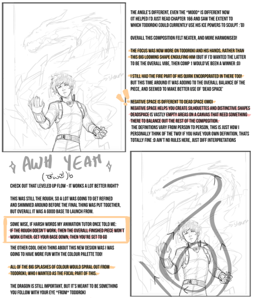
Here’s an example. Normally I don’t post my sketches since they’re just glorified chicken scratch, but this is the best example I could think of at the moment. It’s St. George (for my series sanctus), and normally, you’d see him like this

(Saint George and the Dragon by gustave moreau, 1889-1890 )
or

(Saint George and the Dragon by raphael, 1504-1506)
this.
It’s a pretty common depiction, since it goes back to medieval times. The similarities are that he’s on a horse, he has a spear/lance, there’s a dragon, and he’s attacking it.
The big picture (haha pun) is that I wanted to also have my subject be st george (side note, it’s kind of the theme of the series), but different enough from past artworks where I’d know it wasn’t enormously reminiscent of the traditional depiction. So I aim to keep the basic idea, and see what goes on from there.
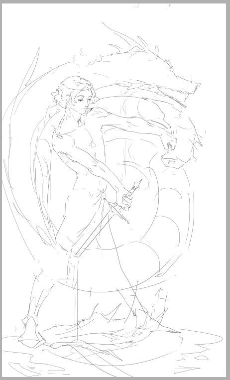
This is the first sketch I did, it was okay, I knew I’d never drawn anything like that, which is good, but composition was lacking. I wasn’t so hot about this, so I dropped it. I kinda like it so I might revisit it . Additionally, though, it strayed a little too far from the main idea.
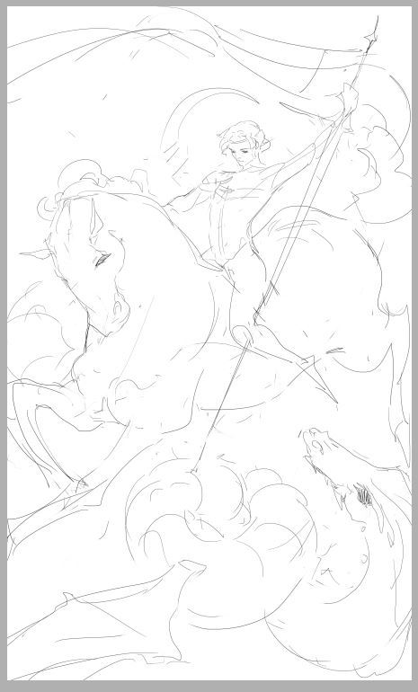
Above was the second sketch, after I’d finished roughing it out, I knew immediately it wouldn’t do. I was satisfied for about 2 seconds, then I got disappointed and stayed that way.. If I put it side by side with the other million or so paintings of st george, I doubt I could tell it was mine. It was practically the same: horse, lance, dragon. The action was too similar to other portrayals.

Definitely….nah
It’s not as similar as the previous one was, but I didn’t like it. That’s a good indicator too, whether you like it or not. I’d tried to fuse the first and second sketch because I did like the first one somewhat, but it didn’t really work for me. It’s just so awkward …

So I left the piece for a while, and came back and did this. It was different, simpler (which can improve a piece more often than not), and I liked it. After I did most of the sketch, I said great job u idiot it only took you a week to come up with a sketch the hell is wrong with u, went to bed, and woke up happy, and normally it doesn’t take me 3 actual sketches or something to come up with a good piece, and I was getting pretty fed up before the last sketch, but good thing I didn’t give up (this time. hah) This is basically how I go about my pieces for now.
tl;dr Don’t give up! (haha I lied, go back and read)


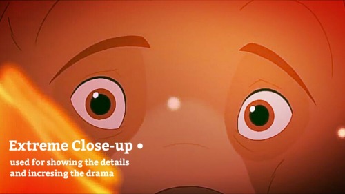
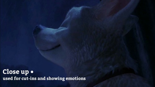
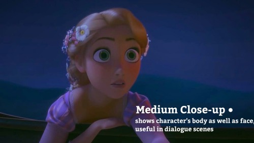
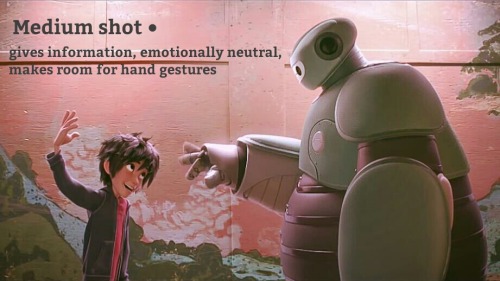
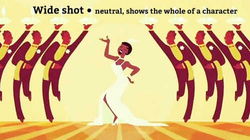
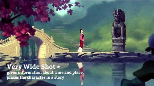
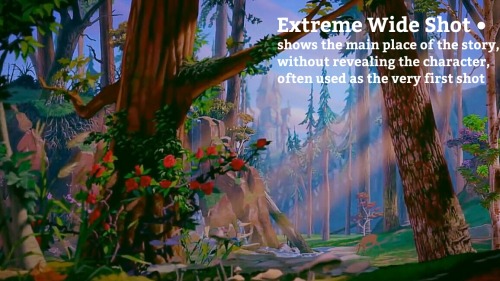
Wandered into an article with 140 iconic cinematic shots, the comments complained there was no explanation to their composition. Decided to give it a run down and keep it to myself.
The compositions are mostly self explanatory but I wanted to see what patterns I could find. That’s just how you learn stuffs.


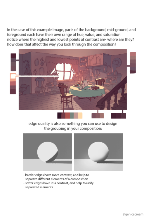
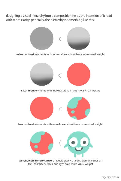
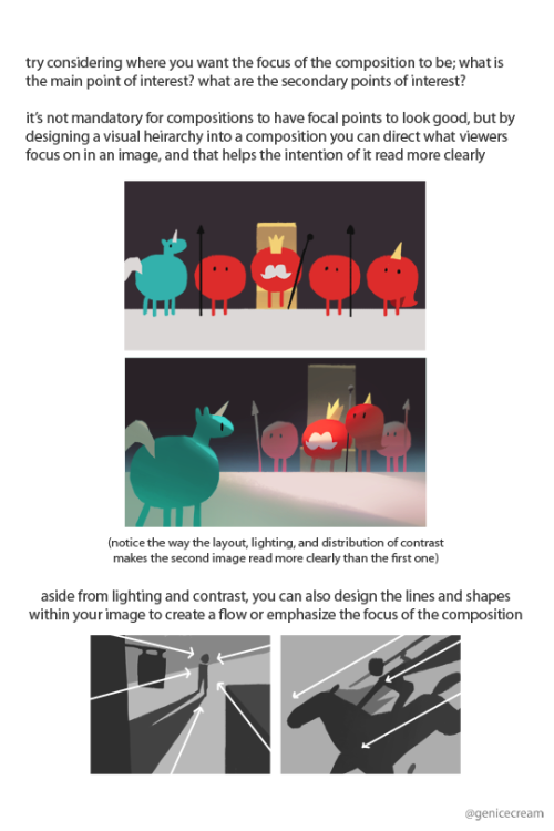
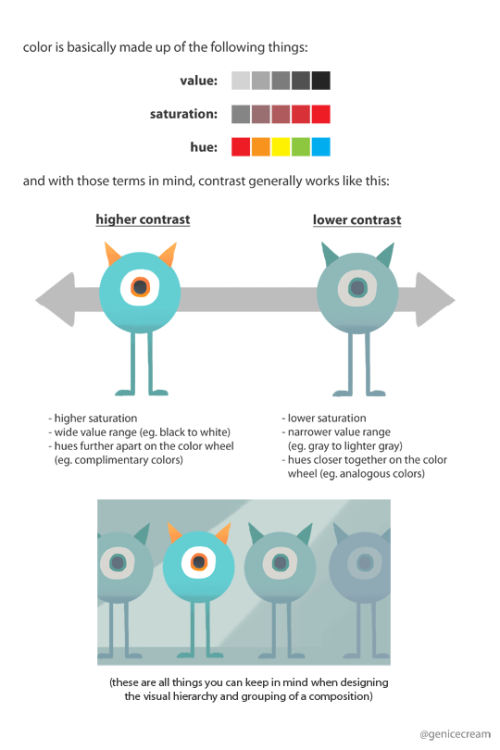
friday night tutorial time
this post is massive but i tried to cover both the conceptual and technical side, hopefully it’s somewhat coherent
continued under cut
Keep reading
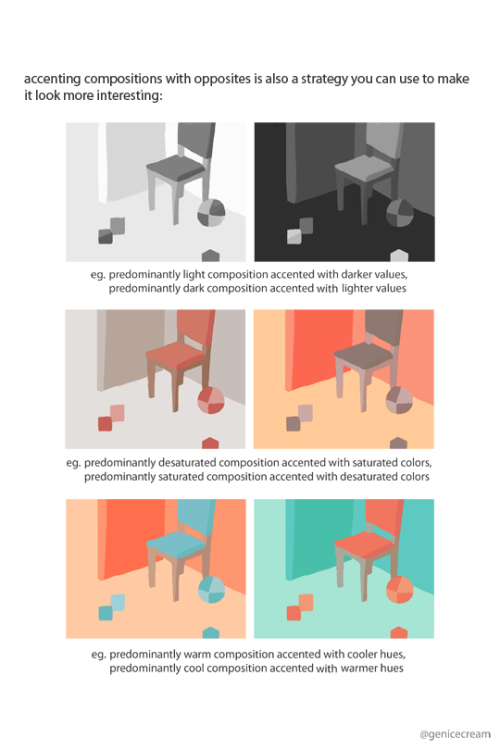
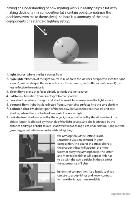
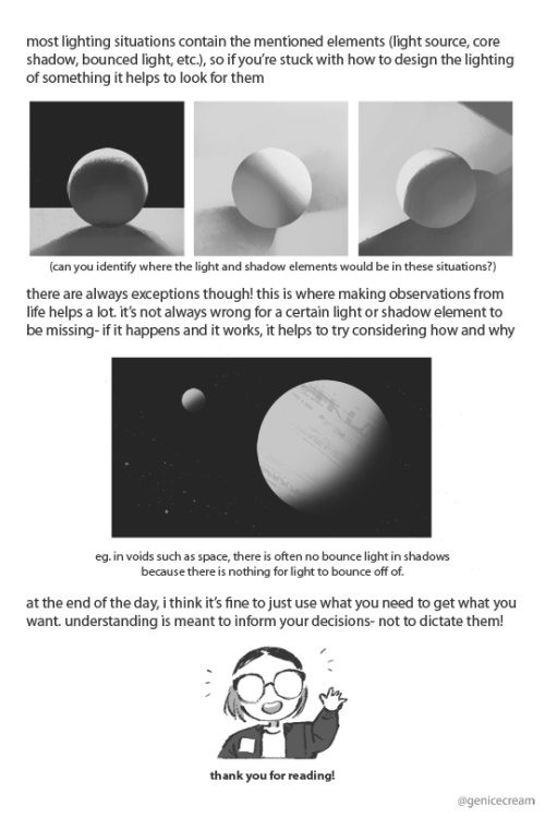
a series of composition tips i’d been sharing on twitter!
and since some people had asked, i’ve put up a pdf version of this on gumroad along with a layered psd of one of the example images too
tips would be really appreciated, but it’s up for free!
Wandered into an article with 140 iconic cinematic shots, the comments complained there was no explanation to their composition. Decided to give it a run down and keep it to myself.
The compositions are mostly self explanatory but I wanted to see what patterns I could find. That’s just how you learn stuffs.

at last, a sorta tutorial!
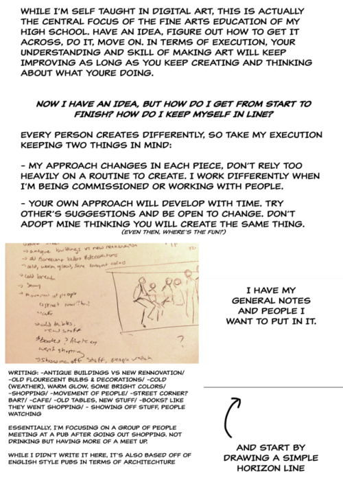
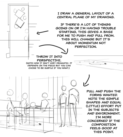
This is honestly a very loose, general rule of thumb when you’re considering how to put together a drawing - take everything I’ve said with a grain of salt (and a dash of your own experience), because composition and flow is super subjective
this is just some shared personal tips based on my own learning - but I hope it helps anybody who might be struggling n_n
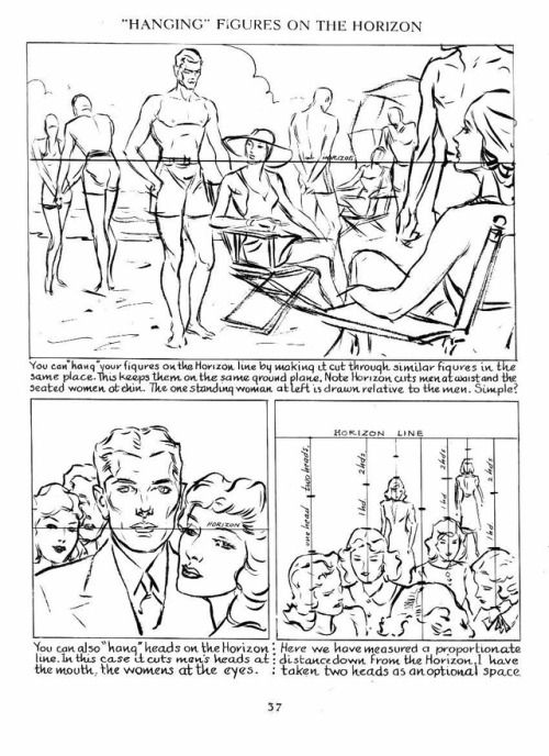
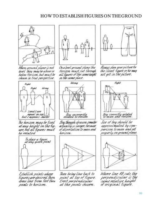
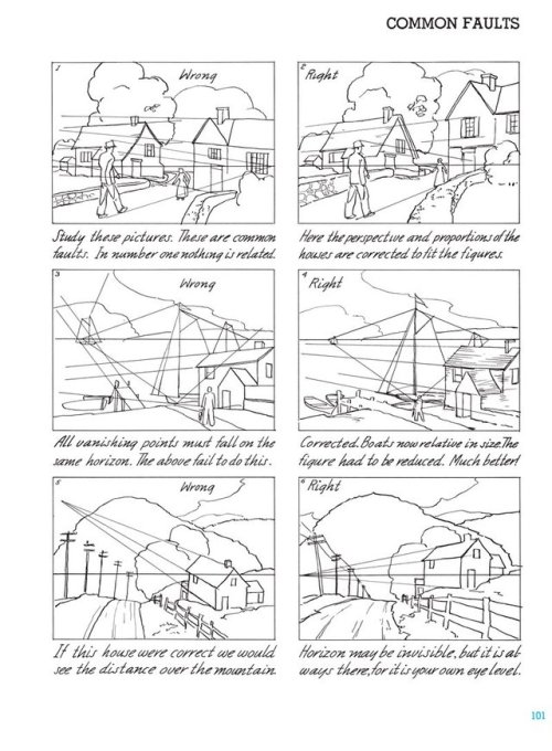
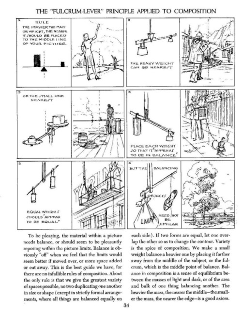
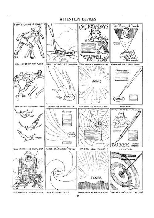
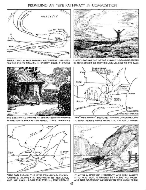
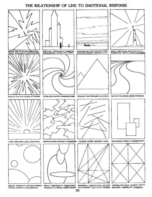
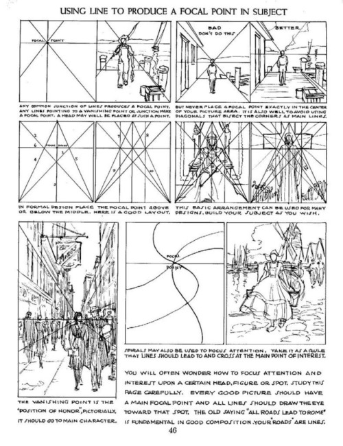
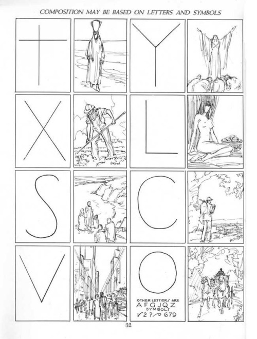

Some sample pages from Andrew Loomis’s series on how to draw comics, 1939-1961, concerning perspective and composition. (The changes in font and layout stem from the fact the pages come from different prints.)
I tried to collect the most useful pages, but of course I’m limited to only 10 images per post.
This is a follow-up of sorts of the Disney “how to draw comics” handouts I posted earlier, and which can be found HERE.

