
262 posts
Chikasartrefblog - Chika's Art Ref Blog - Tumblr Blog
![Title card reading: [Storyboarding Basics. Brought to you by NU Animation Club, March 23 2023]. There is a chibi drawing of Feeb drawing on a CINTIQ](https://64.media.tumblr.com/1bb4994121212e48c92ee88de5cbe45d/8f6b9c73271b12ac-28/s500x750/efeaa63ce1f755c3643a35f0973a68f1f1057236.png)


a couple snippets from a presentation i gave at school this past week on storyboarding!!
‼️DISCLAIMER: I am still a student and have only worked on student and indie projects! This is just stuff that I personally find helpful as an amateur, so feel free to take it with a grain of salt!
Happy boarding, friends! ✍️💕
Timing/Inbetweens
Timing is probably going to be one of the trickier subject for me to talk about… Mostly because it’s something I cheat a lot and it’s one of those things that I just draw what I feel is right.
But basically…
The further apart your drawings are, the faster the animation will go
The closer together your drawings are, the slower the animation will go
So:

Timing out your animation like this will make it look nice and smooth and whatnot.
Your main key poses will always be the most extreme position your character can go. The frames in between just show us how fast they get there. It’s good to vary how fast or slow the character is moving depending on what they’re thinking or doing.
But for the sake of this tutorial, here’s how to go from pose to pose with TVPaint!
So here we’ve got two poses:
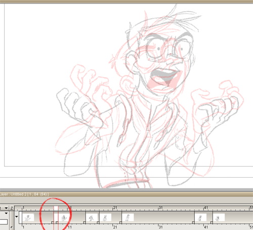
As you can see, I’ve got the light box turned on. I made a new frame between my two keys and now all I have to do is draw between the lines!

There. One inbetween down. I gave the screen left hand a bit of drag (making that pose a bit more of a breakdown) to offset it from the other hand a bit… I just realized he’s totally twinning throughout, oops. I don’t feel like fixing it. :T
It may seem a bit confusing at first, but you just have to go through it bit by bit. I usually start with the eyebrows, which is why I coloured them in. Makes it easier to see. This is also where I use the , and . keys to flip back and forth a LOT to see the motion. It’s difficult sometimes to see where a line should go when you have a character this detailed, so flipping helps a bunch. (:
From here, to add more of an ease-in from the first pose, I would put another frame before this one and draw between the lines there. If I want more of an ease-in, I’d add another frame before that one. If I want an ease out as well, I’d put another frame after this one, then another after that one and so on.
Just make sure your inbetweens are always half of the previous space… If that makes sense. Lemme try another way… Make sure you’re always drawing your inbetweens so that they’re half of what the space between the previous two frames was so that it creates a nice smooth settle. Otherwise you’ll get some weird timing where your character will slow down, then speed up again and then slow down again. Make it nice and smoooooth
And remember!! You don’t have to have a drawing on every single frame. Inbetweening mostly just makes it look nice and makes your actions read clearer. If you find yourself just tracing the same lines over and over again, hold the pose and do the lip sync on another layer.
Also, I have my settings set to 24 frames per second and I animate on twos, meaning I only have one drawing for every two frames. Sometimes I animate on ones for really fast bits or if I want to speed up the timing just a little bit.
Here’s my inbetweened animation!

I noticed he was being held for too long during “NOT” so I opened his eyes and added an inhale right before he goes down for “a”.
I uploaded a Quicktime of this here with the frame numbers (keyframes are circled, the B stands for breakdown): http://notquitenormal.wanecc.com/animations/moron.mov
So yeah, you can look through that frame by frame with your arrow keys if you want. Don’t judge me on some of those inbetweens, I just wanted to get this done, haha.


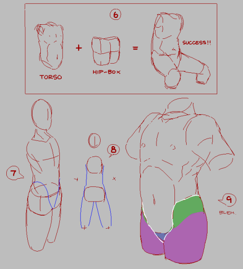
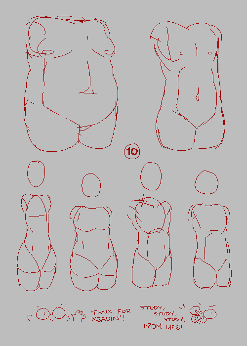
Anatomy tip weekly! :)
This week I’ve prepared something for people who sometimes are confused how to start drawing. Instead of starting with head, start with torso.
I guess most problems can be solved while designing torso. Every body part needs to follow torso.


heyo! don’t worry, your english turned out fine, dude.
as a foreword of warning, it is best that you don’t use this post as a standalone tutorial, instead, try to use it as a study aid to help you make sense of real-life references. (same applies for any decent “art tutorial” out there, really. :p)
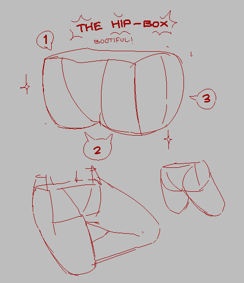
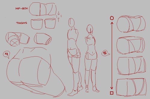
bolded numbers correspond to the numbers on this post’s pictures.
Read More


Since I took down my Patreon, have this tutorial for free.
KOFI ‘s are forever greatly appreciated! (*´꒳`*)


This is the study of a friend of me who is learning and studying storytelling
it is from THE BAD SLEEP WELL from Kurosawa.
thank you very much @benjelter :) for letting me publishing your amazing work
I really like this movie, one of the best crafted Kurosawa’s movies ever. I recommand to watch the movie first to read this study. I hope it can help you to understand what that means to study a movie. I really mean to open a body like a medecine student. :)
Try to find what are the ingredients in the cake, not to describe the cake.
reffer to my study of notorious I did if you want to see more.
so as you can see, just copying the composition is far from enough. that’s an advice from my former head of story on incredibles 2, believe me on this. In general, I m just repeating dumbly all the advices I m hearing at work, of course, I m not pretending I created them ^^
I suggest to do 5 to 10 study like that a year when you start storyboarding. that is also pushing you to watch more movies :) so that’s rad :D I really insist about watching a ton of movies, like 100 to 200 new movies a year, especially old classic stuff :)
I m on letterboxd, I did some cool movies list if you need some cool stuff to start https://letterboxd.com/melodeamon/
here is the conclusion of Ben’s study of the bad sleep well:
——————————————
I’ve tried to dig really deep into the subtext of this scene so there’s a chance that I have interpreted some things differently than the intentions of the director. This scene begins at 1:19. Nishi has just saved Shirai from a hitman only to bring him to the very window that his own father (Furuya) jumped from to commit suicide. He intends to murder Shirai in the same way. He brings Wada with them. The way that I understood this scene was that on the surface it is Nishi’s first big victory against the criminal bosses. The subtext of the scene on viewing it a second time (knowing the ending) is that this may be the moment that it is subtly revealed that Nishi is not brutal or evil enough to destroy this powerful entrenched organization. When faced with the opportunity to murder Shirai, Nishi does not follow through with his plan. He spends effort at the end of the scene justifying this to himself and Wada as if it were part of the plan but I don’t think that he fully believes it. Light Although my line drawings do not do it justice, I think that the lighting is critical for this scene. The flashlight is used as a device to direct our attention and to motivate many of the shots. It seems like the flashlight is also used symbolically to represent the truth. When Shirai is forced to confront the truth about himself and Nishi’s father it is almost as if he is beaten down and destroyed by the light. Like a cockroach he wants to run from the light to hide but wherever he goes Nishi is there to force the light (and the truth) down his throat. Nishi even holds the photo (which is lit by the flashlight) up to his mouth as if force-feeding him the truth. When Nishi tells him the truth, he lights himself up with the flashlight. Even when we see the window from the outside, it is lit by the powerful light. Shadow This one is a little less clear but I believe that shadows are representative of the past in this scene. When Kurosawa wants to avoid having a shadow he can place the flashlight in front of the character and when he wants to have a big shadow he can move it to the side. It seems to me that the placement of shadows was deliberate in this scene. When Shirai’s past is exposed for the first time we can see a big shadow of his head on the wall. When Nishi tells Shirai about his own past as an illegitimate child we can see his shadow on the wall as well. The biggest shadow of all comes when Wada confronts Shirai though. After just talking about everything that happened to Furuya, Wada confronts Shirai. Moments ago Shirai thought that Wada was dead under the same circumstances as Furuya so this is like a ghost of his past confronting him directly. Wada’s shadow on the wall is huge and totally engulfs Shirai. It eventually leads to his collapse onto the ground as the weight of the past becomes too much for him to bear. Staging This is one of the most obvious things in the scene but the way that Nishi is always the highest in the frame and Shirai is being constantly lowered is representative of the way that Nishi is standing strong while diminishing Shirai’s reputation and confidence. Nishi is not lowered until the end of the scene. Although he outwardly seems pleased with the results of the night, I think that internally he is disappointed that he was not able to go through with the murder. Camera movement/rhythm At the beginning of the scene the window is established as being on the very left side of the room. For much of the scene the camera is panning left. Nishi is pursuing Shirai as he runs from Nishi, Wada, and the past. It may be that this overall camera movement shows the progress of Nishi’s goals in addition to Shirai being forced to the window. Moving to the left represents forward progress in Japan much like moving to the right does in the West. When his resolve is strong and he is planning to kill Shirai the camera moves left. After he has given up on murdering Shirai the camera switches directions and moves right. This probably represents Nishi’s growing farther from his goals for the first time in the movie. I also noticed that the camera makes a dramatic turn in the one moment where he is trying to throw Shirai out of the window. This makes us feel very off balance and helps us to feel the drama of the scene by having a unique camera move to accompany it. We actually have the opposite camera turn but much slower after that shot where Nishi walks closer to Shirai. It seems like it’s to look up at Nishi and make him look dominant but maybe since it reverses the previous camera move it could also represent a return to stability. Motivating shots This may not be unique to this film but I found it interesting: I think that every shot in the scene was motivated except for the shots where we are quickly cutting back to a shot that we were already looking at. It seems that the reason this works is that the previous shot is well established in the mind of the audience. The best reason to motivate a shot is that the audience should understand what they are looking at immediately. If the audience already understands what they are seeing because it is fresh in their memory, that works too.


Phew this turned out longer than I thought! Hope this helps someone though, the perspective rulers in Manga Studio 5 are super handy once you get the hang of them!
It's no problem, you deserve all the praise with your hard work! Do you actually have any advice to share on beginner animators like myself? And which programmes to use to make animating easier?
Hiya! Sorry to take so long to reply! I’ve been under a huuuuge workload the past months, and I when I finally got more time for myself I was just too tired to do anything else than simply rest. But here it is! I listed couple things I could think about how to think when you animate. Of course this is only my personal list, so I understand if someone disagrees.
It goes a bit in-and-out the range of actually animating things - but I feel like there cannot be one without the other, so here we go!
Hopefully this will be helpful!
1) Animating is SLOW

The biggest advice I can give is that animation is not easy. It’s hard. It’s tedious. It’ll always take like double the time you think it will. And that’s not on a scale of hours, but days and weeks. You think your scene will take 3 days to rough out? It’ll probably take 6. You think you can clean it up in 1 week? Book in 2,5. Just get some coffee and continue. It’ll be there. Eventually.
2) Take breaks

After a while you’ll become blind to the animation you’re making, so remember to take breaks. Take 30 min break, and when you get back to your animation and play it through you can usually spot a thing or two you just couldn’t see before. It’s also good for your body - I have to admit I tend to sit at my desk way too long hours, but I’m trying to get better.
3) Work out

I feel like I say this every time, but be considerate of your body. I’ve seen so many people having problems with their wrists and elbows, and the best thing to prevent those is to exercise. It also clears your head and ALMOST prevents you from getting sleepy while animating.
4) Start loose

I tend to start with really loose thumbnails in order to get the movement I want. Sketch those thumbnails in so loose that only you can tell what’s happening. You want to feel the movement, making the character pretty comes later. If I start with the construction, I realize half way that the character moves more like a machine than a living thing. Of course this is different for everyone. Some people can be like super humans and draw the final line in one try - I’m not one of them.
5) Kill your babies

Don’t be scared to ditch something that doesn’t work. Of course you want to keep the perfect looking key that you used so much time to finish, but if the movement doesn’t flow, it’s fine to get rid of it. You can use it as a base for your new better drawing
6) Toon Boom vs. TVPaint

These are the two programs I’ve used for 2D animation (+ Photoshop, but that was a bad idea). I actually started with Toon Boom and learned about TVPaint only later. I really like both of the programs, but they have some significant differences.
Toon Boom
Toon Boom is really advanced, bit confusing, originally vector-based 2D animation program. It’s really good, but learning to use it is bit of a work. I started with Toon Boom, and I’ve done most of my personal animations with it. My favorite part of the program is the vector line. You can tweak the line, resize, recolor, do almost anything you want even after you’ve finished your animation. Of course sketching with vector doesn’t feel as good as sketching in Photoshop, but nowadays the newest Toon Boom has been really improving with the feeling of the drawn line and they have even introduced bitmap based layers.
TVPaint
TVPaint is bitmap based program and much easier to learn than Toon Boom. It’s basically Photoshop with proper timeline and light table. The bad thing about it is that if you want to change something after drawing the frame, you better draw the whole frame again. It does feel much more natural to rough out the animation than Toon Boom though. Also the timeline and light table are better than the ones in Toon Boom. If you want to just find an animation program to start with, I guess TVPaint is a better choice. I did start with Toon Boom though, so can’t say learning it would be impossible. It just needs slightly more work.


how do you get so creative with your outfits? ive always struggled the most with dressing my different characters
thank you so much! ;0; that’s very reassuring to hear because i do still struggle with it! this is gonna be a long post, sorry!
i try to consciously consume as much fantasy art with characters whose costume design make sense. i redraw, reference, and experiment;
research/moodboardsi like to browse character design art and collect references of characters with the outfit/armour or vibe i want; my brain likes to look at this stuff painted/drawn, i’m hyping myself up for drawing while looking up others’ art. i also look up photos of elements that are actually made, both historically-accurate pieces from museums, and stuff made up for cosplay - they give me the idea of how it actually behaves on a body, and how functional it is. i personally dislike shit like floating pauldrons, chestpieces that makes no sense, and general idea of all aesthetic and no function. (but you do you)i screencap/save all the pieces onto one reference/moodboard so that i can glance quickly at them while drawing instead of franctically clicking through tabs to find X.
studyi like to grab a photo of a piece and make a study. usually by first tracing to get the shape memorised, and then making a drawing it while just using the photo as a reference - i find that redrawing these pieces helps me notice how they work, what goes where, why am i drawing this strap??– oh it goes here and does that, makes sense, didn’t notice that before; once you know how a thing is constructed, what it needs, what it can’t have - you are able to construct it yourself.this step is especially helpful for things i haven’t drawn before, i’m not doing this every time. it helps you understand the material.
designlooking at the moodboard i have i draw outfits onto the character; some i redraw accurately, mostly i focus on one element of it i like and try to translate it to my style and overall design. i find myself that drawing the pieces themselves is easy enough, but what gives me trouble is to try to keep in mind what mood/feature i’m going for when i move onto actually trying to come up with stuff.
examples!
this is what i did with the outfit designs for retka. i wanted to keep the outfit#1 reminiscent of a ship captain, #2 and #3 of a bounty hunter - comfortable to walk around with, simple; #4 is casual and lightweight; #5 is more orcish and ornate, i don’t imagine it’s easy to quickly put on when going out in a rush to fight, and it’s so different from everything else because retka herself is distant from her orcish heritage. the element i wanted consistent is high boots and a coat - they’re not the same garment, but the same kind, even her orcish straps around her thighs imitate the coattails: (more+zoom here)

——-
once i have a design ready i like to break it down to see how it works and if it actually makes sense:

——
i like experiment with colours (i now see in this piece i didn’t go wild enough) to find the palette i like! (more+zoom here)

and that’s the short version ahah i recommend following concept and character artists, character design enthusiast; pinterest and artstation is full of photos and art, and they’re my go-to; good luck to both u and me my dude because outfit design is fun but TOUGH

A tip for blending when painting digitally: use a transition color! I quickly made this when my brother asked for art advice while I was working on a painting for my best friend. (I was watching a lot of makeup videos to pick out her gifts).
warriormeal asked about: Finding a balance between hard and soft shading
I wrote a post a few years ago that talks a little bit about how light works, which you can find here:
http://helpfulharrie.tumblr.com/post/102124105196/when-coloring-a-figurefaceobject-how-do-you
but with hard and soft shading, you want to think about what kind of light is being cast!
Soft shadows, or form shadows, are created by weaker light sources - things like ambient light, stuff that’s glowing, the sky, etc.
These make shadows soft by bouncing around the environment until they hit the object, so lots of little weak bits of light hit the object creating those soft edges.

And then hard shadows are created by strong light sources, and particularly, those strong light sources being obstructed.
These are created by things like direct sunlight, spotlights, light streaming in through an opening like a window or a crack in the wall etc. Powerful light sources that cut through the darkness and hit the object directly.

Light cannot pass through a solid object, so where light cannot reach is where shadows are formed.

the sharper the edge of something, the more rapidly light is cut off as it finds it harder to reach the surface. This makes shadows cast by another object obstructing the light, and shadows along sharp edges particularly hard shadows.

Additionally, the further away light gets from the source the weaker it will be as the rays start to lose their energy.
Light works by bouncing off of surfaces, and we see when that light bounces into our eyes. Every time a ray of light bounces, though, it loses a little bit of its energy and grows weaker. So the further it gets, the more it bounces.

And, shadows grow softer around the edges as there is more light bouncing into the shadows, and the light itself loses its energy.
The reason for this is - you know how when you stand under multiple light sources, your shadow itself multiplies into multiple weaker shadows that layer up on top of each other? And they get darker the more they overlap?
That’s because there’s multiple, weak beams of light. Where one light can’t reach, another can, which makes the shadows lighter until the areas they cant reach overlap.
This is what happens when a single light source starts to lose its energy - the beams are closer together than in multiple light sources, but the effect is the same.
In a strong beam of light the rays are moving in a unified direction

But the more that beam splits and bounces off in different directions, the less unified that beam becomes

Which gives you that softer edge to the shadow as those shadows start to stack up until none of the beams can reach past the object to the shadows.

So! finding a balance between hard and soft shading is a case of figuring out your strong and your weak light sources. Where is this light being obstructed, and how strongly the light is hitting it.
In this piece, there is a small open trap door above them, and a bit of light leaking in through the floorboards above.
So most of the area is cast in shadow with some strong light beaming in from above, and the rest of it is ambient light which gradually gets darker the further in you go.


Hopefully that makes sense! If you can, you can support me on Patreon, Liberapay, or Ko-Fi so I can keep writing these posts! Thank you 💕
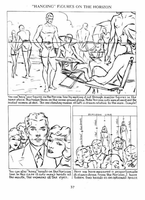
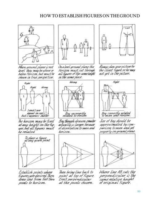
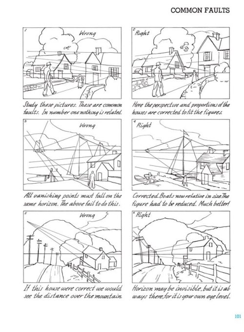
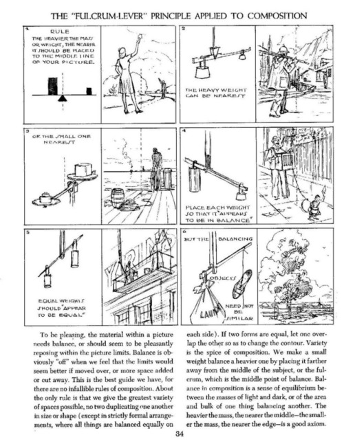
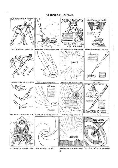
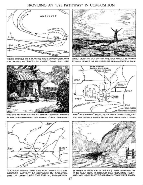
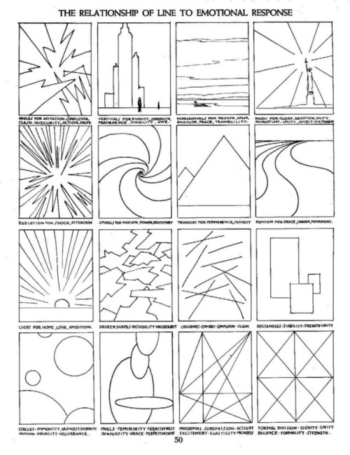
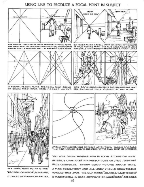
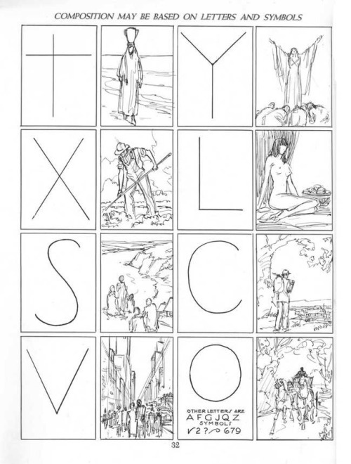

Some sample pages from Andrew Loomis’s series on how to draw comics, 1939-1961, concerning perspective and composition. (The changes in font and layout stem from the fact the pages come from different prints.)
I tried to collect the most useful pages, but of course I’m limited to only 10 images per post.
This is a follow-up of sorts of the Disney “how to draw comics” handouts I posted earlier, and which can be found HERE.
I've always loved drawing people and especially portraits. Your art is so inspiring! Do you have any advice on drawing portraits with accurate proportion? What aspects are the most important in portraits, do you think? And what are good exercises? I'm sorry for bombarding you with so many questions! :3
Thank you! There’s one thing about drawing portraits that I don’t think I’ve ever touched on, and it’s the technique of constraining features. Basically, it becomes easier and more intuitive to rotate the face in 3D space once your mind grasps exactly where the features are located and, furthermore, where they can’t be located.
I use a weird double trapezoid shape that I’ve depicted below in red to keep track of facial feature placement every single time I draw a face. It follows the top of the eyebrows, touches the corner of the eye, traces down to the corner of the lips, and finally ends at the bottom of the lips.

The shape of the constraint will change depending on the person’s features, and it works for every angle of the head. For me it really internalized where each part of the face was, as well as where it started and ended. It kinda helps moderate your drawings; i.e., you’ll stop drawing features that are wildly misplaced or off-sized. I don’t literally draw this shape out every time I draw a face, but I see it in my mind’s eye 100% of the time.
If you’re still learning proportions, a good exercise is to grab pictures of people and trace this shape over them (either digitally or with a marker or something) to get an idea of what realistic constraints looks like. Then go back to studying faces, and constantly check your drawing by tracing along the eyebrows and down to the bottom of the lips to make sure that things aren’t off (e.g., the constraint isn’t terribly asymmetric). It takes a while to get used to, but it might help you get a good feel for portraiture.
There’s one other unrelated thing I like to do with faces, and if you’ve seen a lot of my pics you’ve already picked up on it. If you kinda add some shading to the area on the cheek just below the eye and down to the nose, I think it adds a decent amount of depth to a face. Don’t go overboard of course but there’s another little tip that could be of use.


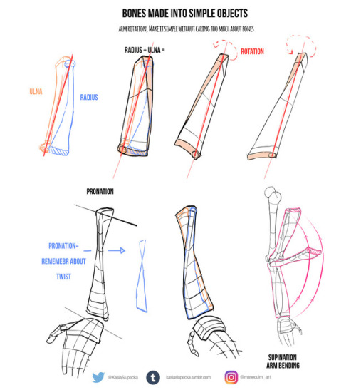
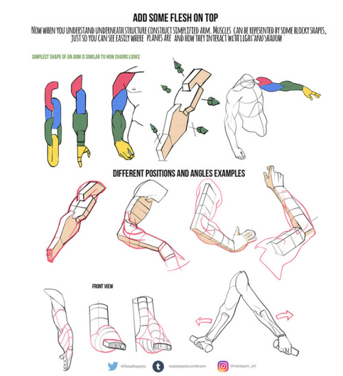
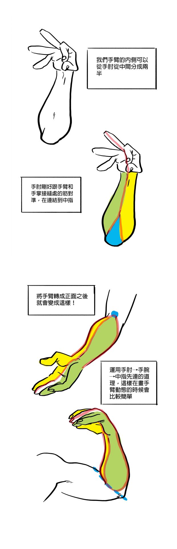
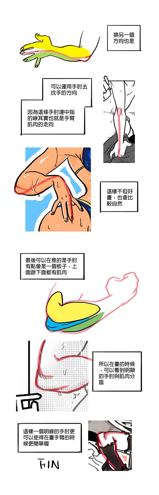
This week I’ve prepared some tips for everyone who is confused with arms. I know that pronation and supination is confusing and I recommend to learn in by heart <3
I have also announcement!
The day is approaching when I will release ebook or Gumroad PDF with all my anatomy tips + additional lessons + commentary.
I still am thinking how I will publish this but it will be done. Anyone who’s interested finally will be able to get everything in one place and some more good content. I will post some dates soon so look for that in next few weeks !
instagram.com/manequim_art
twitter.com/KasiaSlupecka
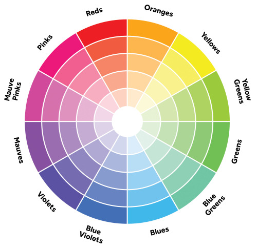
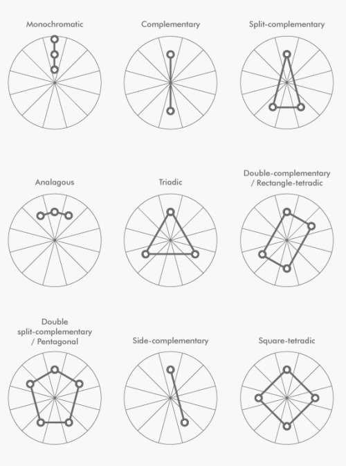
A simple guide to picking a great color palette. No matter what the colors are, using colors that are certain distances from each other on the color wheel result in a great contrast of colors. The simple color schemes shown above are used in the most popular logos, posters, websites, paintings, and even movies and television.


So I just wanted to show some tricks that will improve your webcomic/comic;
So down below we have a quick random page-sketch, if you ask me, it’s really easy to follow and here’s the fundamentals as to why:
1: Comics are Theatre

So a thing to remember that will put a zing on your comics is to have people do gestures, notice below how how the two characters are using their body language along with the second most expressive body part; The hands.
Reason why I say that people should remember Comics as Theatre is because on stage the actors had to do wide expressive motions with their bodies to convey to an audience that could be sitting far away on who is talking and what their mood is. ( this is why William Shatner is so expressive and all over the place during Star Trek. Because he was used to be on theatre.)
If you do notice in movies however, you can spot that the body language is kept subtle. This is because with movies you can get close to the actor and notice the changes in their faces and small things like fidgeting with their fingers to express restlessness…. in comics, this is super hard to express the latter and you could accidentally end up with just characters standing right up in a pose ( i see a lot of new comic artists trying to convey the subtleness of a movie into a comic, and it ends….pretty boring.)
TL;DR: try to express your characters like an actor of stage would! Don’t be shy and don’t let them be it either. You’ll have so fun, trust me.
==========================================================
2: Remember the 180!

so a lot of people talk bout the 180, and I never got it at first til’ i began looking it up. Basically what it means is that two characters or a scenery should always be presented on being on the same side of the page (unless you had a middle panel showing the 90 degree turn of the subject/people.) Notice how the two characters stay on the same side through the page but the left one. It will help the reader to know who is who, and thats A and B when making a comic! TL;DR: Try to keep everything on the same side at all times unless you show a panel with a 90 degrees turn before going to 180. ==========================================================
3: Ayo snake! you cute as hell

This one’s easy! Imagine a snake slithering over yo page ( it’s a nice snek) and you follow it with your eye. Make your reader follow the snakes path as well! No but seriously; Try to always make panels and compositions so that they point to the next panel! Be it via speech-bubbles or characters or environment. Notice how each panel literally guides you to the next. Character A looks to the right while character B looks down to the left, where her gaze hits the end of that panel which is compositioned to guide you down into the fourth panel, where char A almost points with her eyebrows and arms to the fifth ( which goes from top left to bottom right due to character B’s angle. Then just put speech-bubbles in the path and voila! The snake b slitherin’…wait…..Slytherin…oh…
==========================================================
Sizes are everything

Super easy but some forget; Remember to always have the smaller character be smaller than whats bigger than them. Don’t try to flip around and improvise sizes for the sake of trying to get an impact out of it ( unless they get further and further away). Oft it just messes the reader’s perception of size in the comic if you experiment too much and they get taken out of it early and will just end up reading text on pictures. SO this was just some quick tips, hope yall try these tricks out the next time you make a comic c: cheers <3
Why people like your doodles better than your finished works
Learn from your doodles rather than resent them
I frequently see artists complain that their finished works got less attention than mere sketches, doodles and other smaller or less serious work. Which is frustrating! But almost as often, I can see exactly why the doodle got more attention. I’m going to cover some of these reasons, so you can use that information so you can do more than fume about it.
The doodle is easy to read, the polished work is busy

The polished work is completely drenched in little details that the artist slaved over, but the details create a kind of overall noise that makes everything harder to understand, making the whole image less appealing.
Don’t get too lost in little details, work from larger shapes to small details, use things like a highly readable silhouette, contrast, variance in line width or negative space to keep the image understandable. Pay attention to the composition to guide the eye where you want it.
The doodle is high contrast, the polished work is low contrast

When you do lots of details all equally well lit and easy to see, overall you lose the strong lights and darks that make a work pop. You have to sacrifice some of those details, let them be in shadow or out of focus in the background, to create a more appealing image overall.
You might also be forgetting that without lineart you need to use strong lights and darks, since lineart creates it’s own natural high contrast.
Contrast draws the eye, use that to create focus where you want it.
The doodle is simple to understand, the polished work is highly ambiguous in meaning and message
Many doodles that outstrip the artist’s polished work are jokes. Jokes usually have a specific clear focus and message, the viewer can understand it immediately (if they couldn’t, it wouldn’t be funny). You don’t have to make everything funny, but like a joke, you need to get to the point and give the audience the information they need to “get it.” More details can be present, but the viewer should not be confused about what to look at from the outset. Remember: people will look at and interpret your art in milliseconds. They might give it a longer look but only AFTER that millisecond look.
The initial glance is like the first page of a book. If it wows them they keep looking to understand more, if they are lost and confused, no second chances, they’ve already scrolled away.
You can use things like composition, basic structures of shapes and simple shape symbolism to give viewers the initial information they need to stay interested. Don’t feel like you have to abandon more personal and difficult to parse symbolism, these things can work together to create intrigue.
The doodle is fluid and expressive, the polished work is stiff and dead

The sketch for your polished work needs to be done with spontaneity and fluidity. When you want to really flex your drawing skills and show the world your beautiful realistic human faces, your sublime anatomy, gorgeous textures - it’s easy to forget about the undersketch and jump to rendering as soon as you can, creating a stiff or boring sketch that isn’t worthy of all the time you’re sinking into the minute details.
Practice quick gestures, read up on line of action, and before you make a polished painting, make sure you have a sketch that’s fun to look at even without the detailed rendering. Thumbnailing helps. Studies too. Sometimes you have to do the bad boring sketch, but you can take a few stabs at it.
You can’t make a bad sketch good by painting more details on it, you need to work out the sketch first before moving to the details.
Remember, if you’re going to spend 20 hours painting the thing, you can afford another half hour sketching a few different takes on your idea before digging in.
Lots of doodles, very few polished works
If you mostly post one kind of thing, your audience will be people who like that. Also, you may not have much practice with the techniques you are using in the polished work, while you have become a pro at doodles. You become an expert at what you practice, do more of what you want to be known for, become an expert at it, make it the only thing your audience is there for.
The audience is familiar with the subject of the doodle, unfamiliar with the subject of the polished work
Many artists do doodles of fanart and get fed up that people like that more, but the truth is, they don’t like it “more” they just already know they like it. You can increase the chances of people appreciating your original works by making sure they can understand what’s going on in the illustration without prior knowledge of who these characters are, or simply sticking to it until you have garnered an audience. Just keep at it.
Remember, the creators of the property you made fanart of are themselves artists who were pushing an original idea at one time. You can follow in their footsteps.
The doodle is quirky and unusual, the polished work is stale and samey
This can happen when an artist has an image in their head of what a SERIOUS and PROFESSIONAL painting looks like, usually based on a very narrow subset of artwork, often itself based on the same cargo cult of seriousness.
Try studying works outside your usual stomping grounds. Look to artists that likely inspired your faves (if you’re talking about realistic artists who inspired your favorite concept artists, here’s some likely culprits to get you started on the google search: JC Leyendecker, Alphonse Mucha, Norman Rockwell, James Gurney, Rembrandt), look to artists outside your genre, and look at your doodles and ask yourself what “not serious, just for fun” source of inspiration is making them so fresh and vibrant that your audience is connecting to them so strongly. Study that, respect that fun and try to pull it into your serious work.
The polished work was hard to make and no one cares
Being an artist is hard, and that we keep at it is commendable, but struggling and taking more hours doesn’t make a piece better necessarily.
There are a few things to consider here. First, you need to realize looking to the vague faceless masses of the internet for a fatherly “I’m proud of you, son” moment is always going to be disappointing and painful and attempting to guilt strangers into fulfilling that role for you is awkward and inappropriate. You need artist friends who can recognize your hard work and cheer you on and you need to be your own cheerleader, value your own hard work and practice.
Second, you need to realize torturing yourself doesn’t in and of itself make art better. Hard work is something people love about art, the meaning of someone spending that time, but if I screamed for 8 hours, drew a single line, then posted that, the internet wouldn’t be wrong to be unexcited about it. Rather than blame the viewer, think about two things: how can you make the art itself more appealing while still doing the painting that you’re interested in doing, and how can you do that faster and with less pointless suffering?
It’s okay to be a masochist when it comes to art, many artists are, just make sure you’re spending your time and suffering wisely.
You’re complaining about someone else’s “doodle”
Sketches and cartoons are deceptively hard to make appealing, rather than fume that they are getting more attention, look to them for lessons. What could you learn from them? Could you do it? Maybe you should try. Would make a good exercise.
And never get mad that their drawings are more appealing to the internet than yours, even though they spent less time on their drawing than you did on yours. See above for why time is not important here, but also keep in mind they may have been practicing longer than you or may be more established than you.
Keep working on your art, keep posting, push to be seen, advertise your work, put yourself out there. These things take time but work.


INKING TIPS!
Ahahaha!!! It’s finally finished!!!

I’ve been complaining about this one for the longest time so it’s nice to see it finally posted!
Yeeah it’s a bit of a read, and the pages are much better viewed at full size over on my blog, and it’s far from perfect, but it’s my first time making one of these and I’m proud of it!
I put in a lotta headaches, slumps, and heart attacks into this thing and even tho it’s meant to teach ya guys something I learned plenty from it too in terms of better writing out these things in the future.
I’m looking forward to putting out more of these, each more improved and in a more timely manner. If you liked it feel free to suggest future topics and I’ll add em’ to the list!
I feel if I can spend at least some of my time teaching others a thing or two about art, even just a little, then it’ll be worth every second 👍🏽❤
Support the artist!!!
Ko-Fi // PayPal.Me // Commissions Info