Art References - Tumblr Posts


when his fingers do the thing :-)


Spent ages trying to find these refs online.
All art and designs are courtesy of Riot and Fortiche, I simply found it on Wiki and decided to share for fellow artists to use.


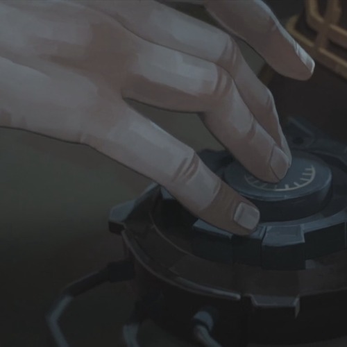
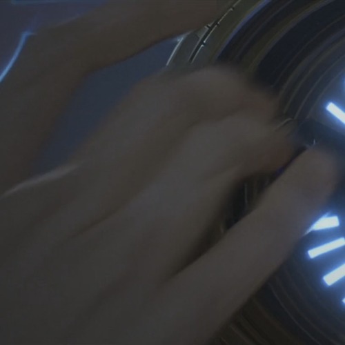
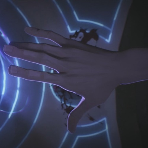
ARCANE | Viktor Texturing & Concept Art | Evan Monteiro


RadenWA is honestly a hero for these


they're got even more than these, too!
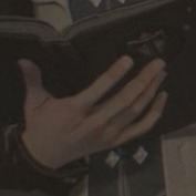
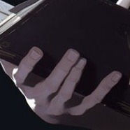
handmade drawing references :)


I took these pictures mainly to analyze my hand structure. Feel free to use them for your art, if you'd like to!


“small thread on drawing plus sized characters!”
Source: Ullaiin on Twitter

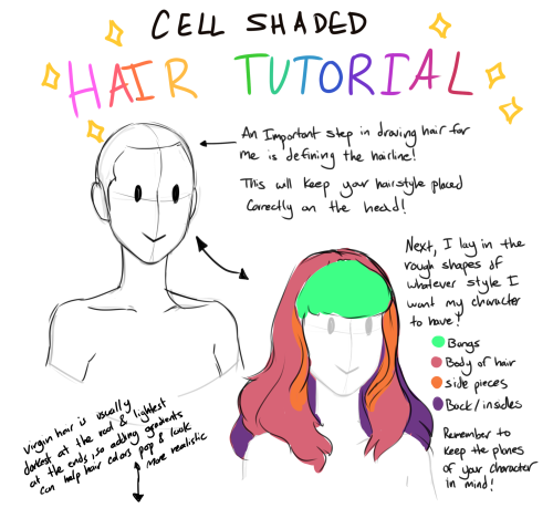
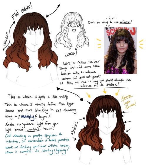
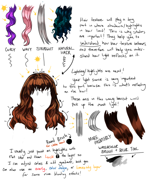
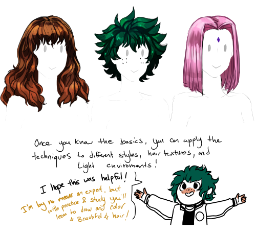
A little hair coloring tutorial because someone on Deviantart asked me how I color hair! I’m by no means great at coloring hair or explaining how I do it, but I hope this is helpful!
Okay finally
Small lighting tutorial (very long post, lots of images)


First of all I work on PS but if you have basic knowledge of your program of choice this will be easy to follow.
Second I use a different layer for everything. So assume that each screenshot is a new layer.
Third I've seen people not knowing how to choose colors for light and shadow and for me it comes out naturally so I don't put that much thought in it, but picking the neighboring color in the color wheel never fails, so lets say you use a red for the lighting, then pick either orange or pink for the shadow. The shadow should be fairly desaturated. However if the lighting is the desaturated you can go wild with the shadow saturation. But this is subjective and it's very dependent on your goals and art style.
Okay let's start:
Line art
Base color

Now for the shadow layer. The layer blending mode is in hard light mode

I use the quick selection tool on the previous base color layer, and in the new shadow layer with the hard light mode set I fill the selection with the paint bucket tool.

The lighting layer is on the linear dodge (add) mode.

I use the lasso tool to select the lighting parts, then I fill it with paint bucket tool.

Then once I have everything, I use the quick selection tool on this lighting layer, and in a new layer also on linear dodge mode I use a radial gradient, drag it from the direction of the light source, you have to try it out on it's own but it usual takes me a couple of tries to get the desired intensity.
Also tbh you can just leave it like that no gradient, if pure cel shading is your goal.

I add all the extra shadows, this layer is also on hard light mode, I use the lasso tool and a normal round soft brush.

This next part is something that I sometimes do and sometimes it's not necessary, in this case since the light source is moonlight the light on the clothes should bounce off on the face so I do an extra gradient. (or just do this if you want to make it lighter lmao)
With the quick selection tool, I select either the base color or the shadow layer, and in a new layer with the linear dodge mode, I use a gradient, it has to be either a fairly dark color or a very soft gradient.

And lastly in a new layer, with linear dodge mode I use a soft edge brush on top of the lighting areas, to give it that glow.
Sometimes, like in this case, I have to use some color balance adjustments, more contrast or brightness.
And that's it. Good luck and hope this helped you, if you have any questions my inbox is open 😊
If you think oh I cant believe this creature just gave me great knowledge for free, and you want to drop a few coins in my direction here's my ko-fi
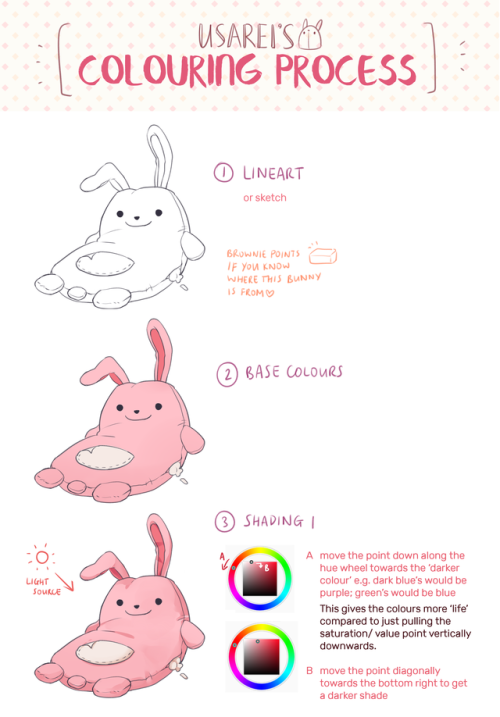
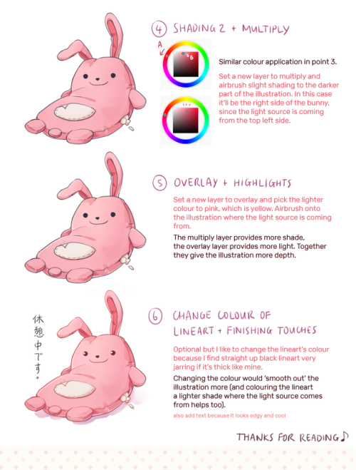
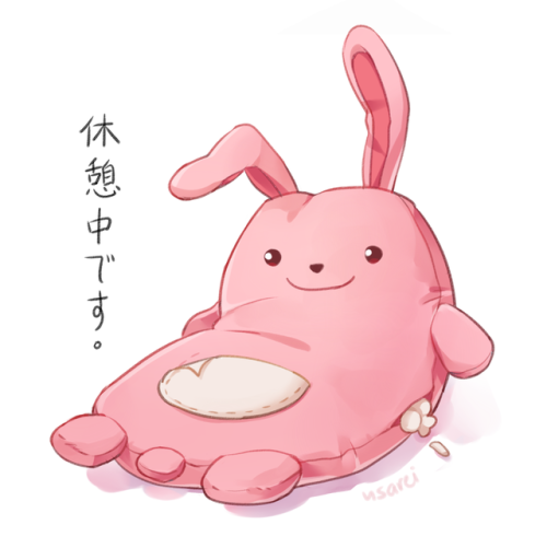
a colouring tutorial/my process of colouring because i was asked on discord for tips on how to colour things and i just farted this out ENJOY
Oh my stars your art is amazing!!! Do you think maybe you can make a shading tutorial sheet? owo
Hey there Anon! Sure thing! I’ll do my best to explain the process of how I usually do things in regards to coloring and shading. I’m not the greatest at Explaining, so I’ll do my best to keep things as crystal clear as possible!
Step 1: LineartI’ll start with Lineart purely because this step is important to the coloring process in one regard, and that is making sure the entire line layer is closed without any holes. Even the smallest little gap will make the selection process hard later, and we don’t want that. So the cleaner lineart you have, the better. I’m going to go ahead and use my Monster Hunter Generations Huntress for this.

Step 2: SelectionEither in Photoshop or SAI or whatever you use, click outside your character and any other negative space surrounding them. This means…basically anything that’s not your character. Then go to Selection > Inverse and invert the selection. You should have something similar to what I have below. This makes it so much easier to add colors without having to worry about all the little nooks and crannies that could mess the cleanliness of the drawing up real bad.

Step 3: Flat BaseCreate a new layer beneath your line layer with the selection still active. This will be our color layer. Remove the visibility of the line layer, and fill the remaining “Silhouette” with a dark base color. This makes those nasty corners look a bit cleaner, as sometimes if there is a lighter color your computer will want to make them stand out pixelated. Again, this is just for cleanliness beneath the line layer. Turn your line layer back on, as they will now act as barriers for the fill bucket tool. Make sure the entire silhouette is filled, and that no lines were accidentally selected! You want a see a completely filled and flat color if you turn the line layer off.

Step 4: Flat ColorsAt this point you can lock the transparency of your Color Layer, and go ham. Either with the pen or a fill bucket, figure out how you want to color your character and add in the flat colors. Notice I’m on the same layer as the Base that we made. This is so those lines still play nicely with one another. Clean up where necessary.

Step 5: Analogous Color GradientWell, we don’t really want our character to be too flat, do we? This is where the color wheel becomes your best friend. Select similar colors with the Magic Wand (like I’ve done her skin tone here) and using the color wheel, choose an analogous (that means “close by” in color wheel terms) color to add a bit of depth to the color. For skin, I usually go with a red or a bronze, sometimes purple. Use the airbrush for this. Then, deselect and select another color to gradient, until all the colors have some degree of new color to them.

See? Now things look interesting! We added some blue to the greens, some purples to the reds, some blues to the grays and so on and so forth.

Step 6: ShadingOkay, here’s where things get interesting. Time to shade. Make a new layer between the Line Layer and Color Layer, and make sure you make it a clipping group/clipping mask. This is so it won’t go anywhere that you don’t have color. Set it to multiply or linear burn (whichever you think looks best) and bump the opacity down to about 40-50%. Choose a color (or color-value gradient, if you have drastic value changes in your piece that make light and dark values not play well with the single color you picked, and swap between those) that you want the shadows to be; I like deep pinks and purples. AVOID BLACK. I first use the Pen tool to get down “hard” shadows - shadows cast by hard materials, close shadows, and inorganic materials. Once I’ve got those down, I head on over to the softer areas, such as the skin, hair and cloth and alternate between the watercolor and marker tools to give “softer” shadows. There’s no real law to this, you just have to know where shadows fall and how they behave and work with those three tools to get the look you want.

Step 7: “Highlights” - Rim Lighting Okay, these aren’t really “highlights” in the correct sense, but adding sort of “rim lighting” around forms really helps make a picture pop. To do this, make another layer above the shading layer, set it to “screen” and keep the opacity at 100%. Then, get really familiar with your CRTL key because you’re going to be color sourcing a lot. To add a rim light to a form, select the base color of that form, and use the marker to trace along the edges. For example, I picked up the nude from the skin, the silver from the dagger, the gold and maroon from the hair and the tawny brown from the skull to use on those specific objects. Any place you want clean works well, but the edges of forms works best for this technique. Additionally, if you’d like, you can create another layer above the Screen Layer and set it to Linear Dogde, and do my “glowing eyes” technique on anything you want to stand out, such as the metal of the belt, gold objects and of course, eyes.

Step 8: The OverlayAlmost done! While your photo can now stand alone as “finished”, there’s one more thing that I enjoy doing, and that’s adding a simple color overlay to bring the whole picture together. This is done by flattening all the layers you have so far (you’ll want to “Merge Down” in order from bottom to top or “Flatten” to avoid the layers going crazy on each other) into one layer. Then, make a layer on top of that one, set it to a clipping mask, and set it to “overlay”. With the Airbrush, choose some colors (I prefer soft pinks, blues and violets) and go along the “edges” of your character with a BIIIIIG brush. This kind of resembles soft ambient lighting or shadows. I just think it makes the photo look nicer.

TA-DA! And Now we’re done!

And there we go! I hope that helped, and I also apologize cause this ask sat in my box for awhile and I never got around to it until now. :PI’d be happy to answer any questions y’all have, but this is the simple basics! Remember to practice practice PRACTICE! -Gael


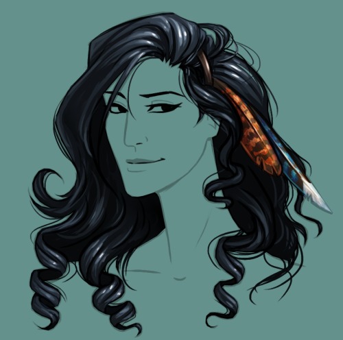
Natural Black Hair Tutorial! Usually Black hair is excluded in the hair tutorials which I have seen so I have gone through it in depth because it’s really not enough to tell someone simply, “Black hair is really curly, draw it really curly.”
The next part of Black Hair In Depth will feature styles and ideas for designing characters and I will release it around February. If you would like to see certain styles, please shoot me a message!


Here it is, my long winded tutorial, complete with some step by step action. I see a lot of people talk about wanting to diversify their artwork but not knowing how. This is my help to you. You really should take the time to invest in learning diverse eye shapes as diverse artwork always makes you a better artist. And frankly I’m really tired of drawing tutorials that talk up character diversity but only have the stereotypical “one Asian eye”.
I did some step by steps for those three diagrams, but I actually got them from this blog which has 14 of those examples! (Bonus: it’s a makeup blog so if you need help with that or want some idea of how to shade these eyes, there ya go)
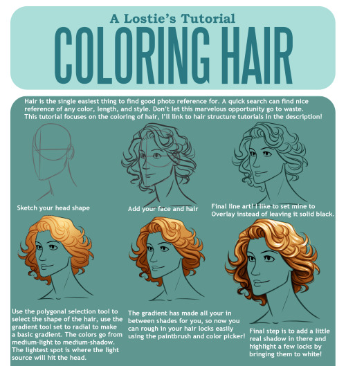
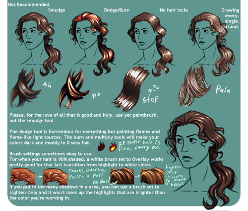
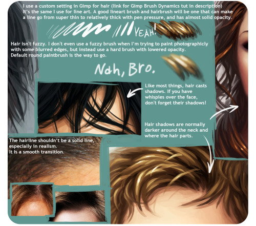
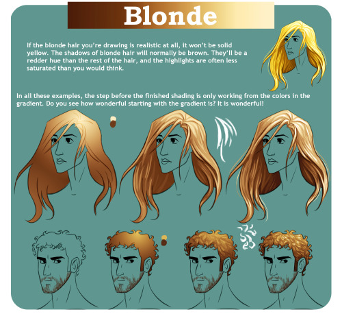
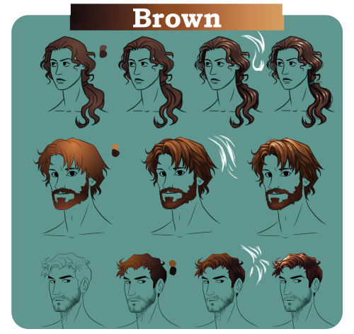
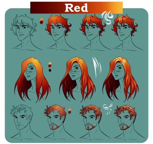
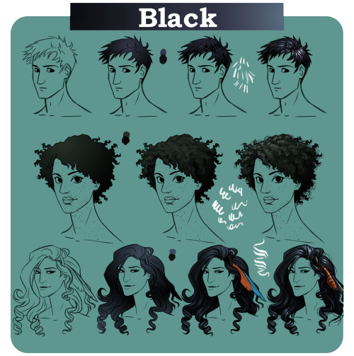
View the fullsize tutorial on DA | The most handy hair structure tutorials are this video by Proko and thisblog post.These are useful for thinking about the direction hair locks flow with different styles: 1 2 3 4 5 | Painting Realistic Hair | Shading with gradients: 1 2 | Tutorials by me including: Gimp Brush Dynamics, Coloring Eyes and Coloring Method.
All example characters are fromThe Silver Eye webcomic!


Because I’m getting a tons of request for this (and since i trolled the last skin tutorial I made HAH), I thought “why not make a quick srs tutorial this time while I’m at the process of painting a piece.
You probably would need to have at least basic knowledge of photoshop to understand what I wrote on there. Oh and basic understanding of lighting to know where your shadows would fall onto to make it look "realistic”. Also sorry for the crappy hand writing, it’s faster to write them down than switch to the text tool and type.
Well, there you go and I hope that helps! We’ll see if I’d manage to do a quick hair tutorial tomorrow while I paint on the hair. :)