Complimentary Colors - Tumblr Posts
This is really quite different from all the other Rothko stuff I (and probably most people) have seen and I honestly can’t stop looking at it, the complementary colours here are mesmerising. Which tbf is a quality I would give to much of his work now that I mention it lol.
I do still prefer his later signature work (for many reasons, partly because they’re so distinctive to him and also because it’s amazing to see how much he can do within a pretty simple format). But I love getting this peek behind the curtain into how he came to his eventual style, and seeing some key elements being used as far back as this.

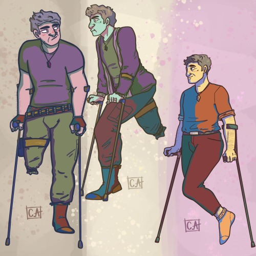
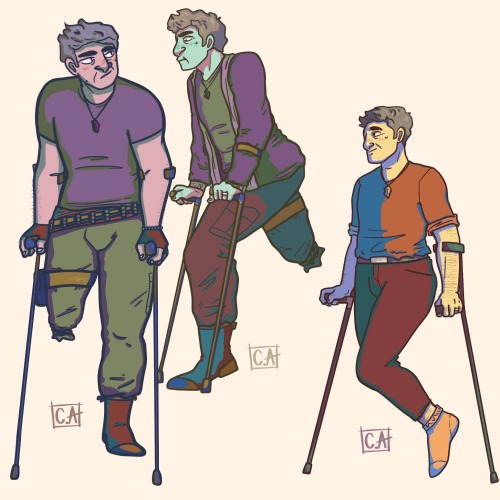
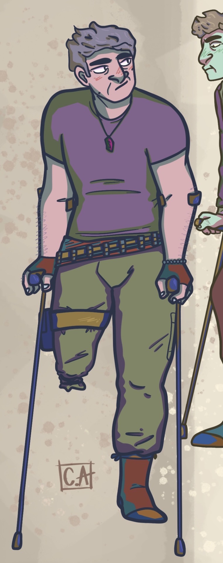
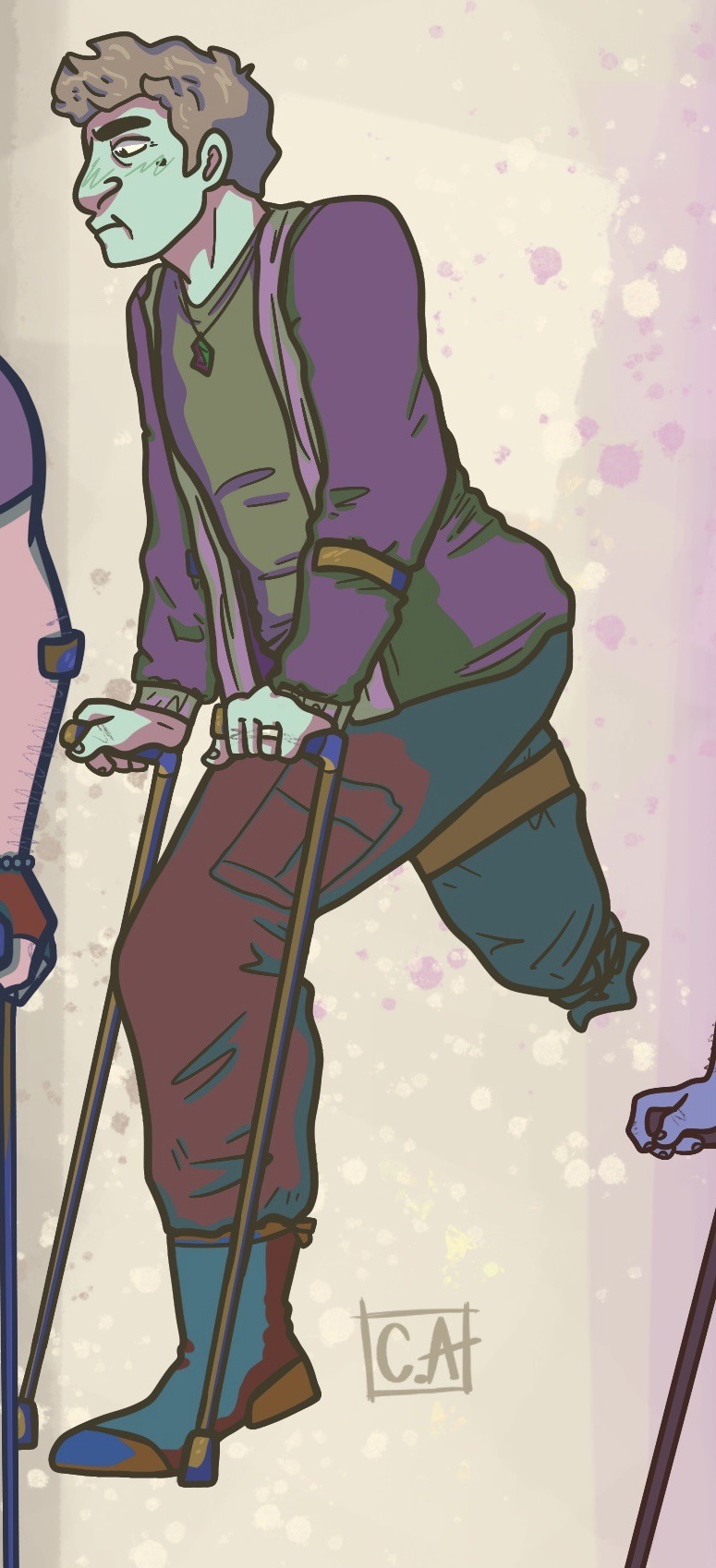
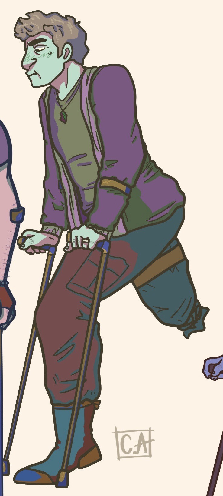
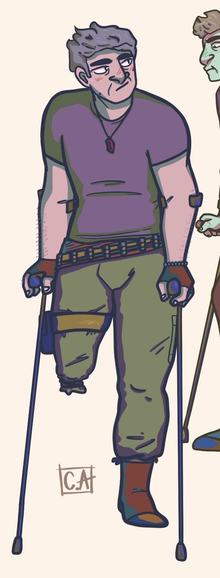
I used a reference from @kibbitzer for these! My character, Adler, without his prosthetic leg :)

That little Hand Thing™️ Stan does

Here's another piece from my 2D design class.
This was to create a diptych painting, using complimentary colors, in this case, blue and orange, on an illustration board. This is what I came up with.

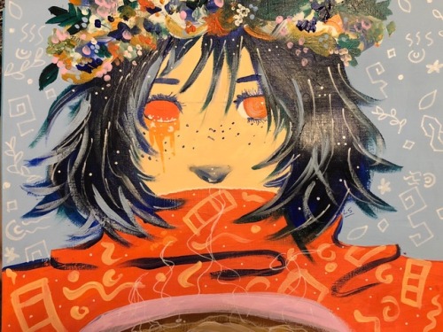
I made this for my Found & Focused class. I was allowed to create whatever I wanted as long as it showed symmetry and a set of complimentary colors.


This was my final assignment for my Found & Focused class. I took a previous assignment and expanded upon it. The orange and blue pattern was the one I made a couple of months ago. I decided to make the same image with the other complimentary colors.
The patterns are seen separately. The final image shows them together.
working on smth pretty nice I reckon, considering giving it to a friend once it's done
its a painting thing, like the paper doll of Bucket I did a while back, but it's gonna be larger

you can't see it too good in this photo, but it's shiny, I put some metallics in the hair
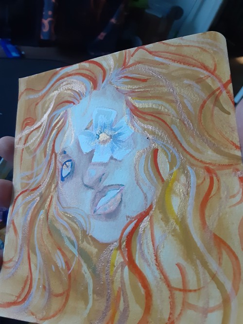
shiny!! how cool is this, I fuckin love metallics


Illustration based on the short story “The Hunter and the Bear” by Caitlin Timmerman