Fonts - Tumblr Posts
hi mem if i could pick your brain about typography - how do you know how to position the words of a phrase on a gif? i'm working on something right now where i want to place a lyric in a more varied fashion than simply straight across the gif, but i'm not sure how to arrange the words so they fit together. sorry i hope this makes sense
You may certainly pick my brain as it is one of my favourite subjects. :) This got a little long, but hopefully it’s not too rambly lol.
INTRO.
Typography placement is primarily about the composition of the gif pre-text, where the word/phrase you want to emphasize is + what it looks like, and how many words/phrases you want to emphasize. We’ll talk arranging the text in relation to itself first, and then about where to place it on the gif (heretofore referred to as the “base”).
1. CENTERED TEXT.
This is pretty much the most straightforward option: you have your highlight word, and then you can center either a)as a stack with lines above and below, b)as a sandwich w lines on the left and right, or c)as a set of two lines either above/below.

Literally the only thing that defines which method you use is a)where in the text it’s located (beginning, middle, end) and b)what vibes you’re feeling that day. My only caution here is to watch for balance: having a ton of text on one side of the main word/phrase and almost none on the other tends to look pretty wonky.
2. SPLIT TEXT.
This method is a variant on the first, except that something about the text/font means that method 1 doesn’t work well. This could be because an ascender/descender gets in the way, because I want a more square shape than rectangle shape, or just because it matches the font better.

Ex.1—“you’re facing down”—the ascender of the “d” is the problem here. If I just centered the upper text, the two words would overlap unless I moved the text waaaaaaay far away from each other (and generally, typography for a single phrase looks best grouped tightly). Breaking up the top line avoids this issue.
Ex.2—“Bending backwards”—the severe tilt of the text made centering it feel off balance (to me). By shifting the top & bottom text to either side, it “supports” the tilted text and keeps it grounded in frame.
Ex. 3 —”when all hope is lost”—has two issues. First, the extreme height of thee ascender of the “h” and the depth of the descender “p” get in the way of top/bottom text, and the circle I wanted enclosing the text prevents a long horizontal composition. Dropping the word “hope” down onto the line with the second line of text, and centering it below the first, avoids this.
Now, a breakdown using Ex. 1, with one I think doesn’t work and three I think could work.

A: As stated above, it crams too close to the ascender of the d, and has a weird boxy feel.
B: Top line is shifted over so it’s not a true center, but because the bottom line isn’t centered you can’t tell. Could work, but I think the order of how you read it gets a little lost since as the the “d” comes first, it makes it look like “down” is to be read before the top line.
C: Placing the “you’re” in front of the “d” fixes the reading problem. The centering looks just fine; perfectly acceptable.
D: This is the version I went with, mostly bc similar to ex.2, I liked the grounding on the left/right. Could easily go either way.
3. MULTI-FONT/EMPHASIS TEXT.
I don’t do this terribly often in the same gif, so two of the examples are from the same set, but I hope they’re at least different enough to give you vibes lol. Basically, the way this one works is you have two phrases/words you want to emphasize, so a blending of centering & forming goes on.

4. SO WHERE DO I PUT IT?
Once you’ve arranged your text, you still have to figure out where it goes on your base. That’s where considering the composition of the image comes in.
Having the text in the middle of your gif is far and away the easiest and most common placement, BUT if you have any gifs that’re heavily weighted to the left or right (for example if you have a gif with a person all the way on the left side and nothing on the right), it’s going to look weird if your text is centered. In these cases I switch to some kind of pattern: either the text maintains a left-right zig-zag (left on gif1, right on gif 2, left on gif 1, etc.), or I alternate between left-center-right-center-left (or left-center-right-center-right, if I want a V). Basically, alternating is key.
Another consideration is if you want to highlight anything with your text. For example, in this set I had a pretty busy centerpiece and having text on top of it would be way too much, but also I didn’t want to distract from it. I solved this problem by arranging the text on a path that matched the symbol, so it felt like part of the image, instead of something slapped on top. There’re a lot of things you can do to mesh text & image, and this is easily where you can have the most fun.
CONCLUSION.
Two really useful questions to ask yourself when working with type are 1)does this feel balanced? and 2)can you actually read it in the order it suggests? Because, ultimately, typography is a vehicle—if you can’t read/understand the words, or the text gets in the way of appreciating the image, that’s really the only way it can “fail.” Otherwise, everything else is just style and flavour. :)
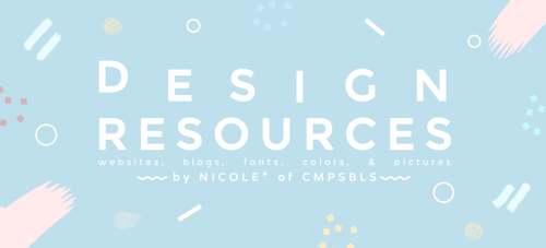
Masterpost I: DESIGN Resources* ⎯⎯ by Nicole*** of CMPSBLS
i get a lot of asks/messages about graphic design so heres a rec list! ***note: i am not a graphic designer so these are just recs!(○^▽^○) *- some sites may have products you have to pay for please look carefully! ⟡ - personal faves! || © - sources
GRAPHIC DESIGN:
is art with a purpose. It involves a creative and systematic plan to solve a problem or achieve certain objectives, with the use of images, symbols or even words. ©
how to speak designer: terms (v useful) (*´∇`*)
TYPOGRAPHY
it is the art and technique of arranging type to make written language legible, readable, and appealing when displayed. ©
lets talk more about my bf typography ♥(ノ´∀`)
90% of design is typography (infographic)
IMITATION VS. INSPIRATION
as we go through these websites note that graphic designers work hard but so pls take care of the artists (he)art please!
simply put: don’t plagiarize dont copy any art ever in the end you’re going to regret it. (;へ:)
DESIGN RULES GUIDELINES there are no rules in art be freE!
6 principles of design + principles of design!
20 design principles ⟡⟡ fav! the inforgraphic is so wOW!
10 commandments of design
effective visual communications ⟡
iOS cheat sheet dimensions + file formats
WEBSITES for inspiration/resources
BEHANCE ⟡⟡⟡ ⎯⎯ for layout ins/fonts
DRIBBLE ⟡ ⎯⎯ for inspiration
FROM UP NORTH ⎯⎯ for lettering/typography ins
THEDSGNBLOG ⟡ ⎯⎯ for everythigN
CREATIVEBLOQ ⎯⎯ for advice/articles!
CREATIVE MARKET ⟡ ⎯⎯ for resources/psds
PIXEL BUDDHA ⎯⎯ for resources
ultimate list
go to places for inspo (i feel alive bc these r great!)
2500 resources omfg…i M ALIVE I am fiLLED with energy
TUMBLR BLOGS for advice/inspiration ++
@goodtypography
@behance
@studioblrcollective - art studyblrs!! lIEK?? omg so useful
TUMBLR POSTS of advice/info & everythign!
@educatier‘s graphic design mps! (all her mps tho!! A+++)
answers by @genspen! (one) (two)
masterposts abt graphic design by @rorystudies
FONTS how to use them & where to get them!
dafont ⎯⎯ rly easy to dl fonts here!
googlefonts ⎯⎯ another rly common site but NICE!
1001 fonts
freebiesbug ⎯⎯ also for icons/mockups!!! fav
behance ⎯⎯ i can depend my life on this sItE
fontsource
100 best free fonts
18 rules, another pin, top 5 rules
you need a font? (infographic)
COLORS & palettes /throws flowers everywhere/
coolors
computerhope
colourlovers
prettycolors
colordot
the art of color coordination (infographic)
color psychology
PICTURES free stock photos backgrounds & gradients!
free stock photos
mp by pistachi-o , neonbikethemes
PLUS stuff fr Nicole
my design & art board on Pinterest
info abt my printables | my printables tag
& thats aboUT IT! those r my recs for design & stuff(^▽^●)hopefully i get to post my other mp about tips in graphic design! i hope everyone benefits from this mp (not just aspiring graphic designers/artists!!) & good luck to everyone! take care & happy designing! (*・∀<*)
he did it again

I love fonts and typography, so i wanted to make a series, where I post and provide you with links to my personal favourite fonts. Please note that not all of them are free, I tried to find free download links for you, but I can’t always provide them!
Here is part three with my favourite script fonts!
downloads:
bettrish // saturday rock // loveline // malina // hallsey // sugarcreates // shania // notera

JUNGJNSOUL’S FONT COLLECTION ♡ a page consisting of free fonts that are available for commercial use. sources of said-fonts are linked directly below them. also includes the following filter options: body fonts, header fonts, handwritten, monospace, or decorative. very much so inspired by the font pages of @redjamies & @666rps !! please like or reblog if you found this helpful.

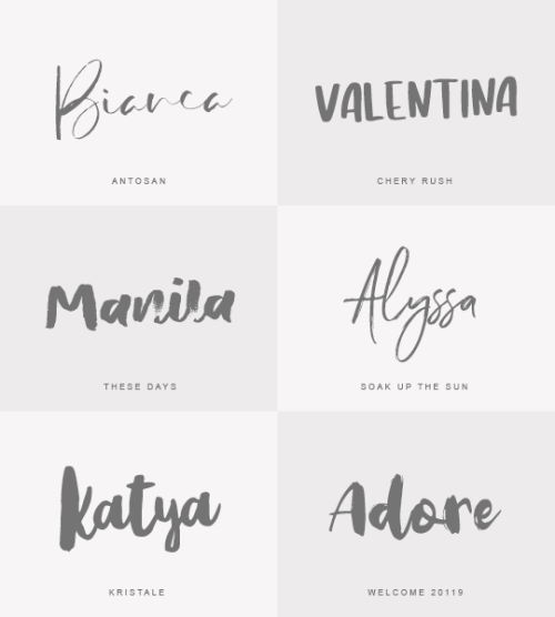
sweetheartwrites font pack #2
due to the overwhelmingly positive response to my first font pack, I decided to make another! this pack features pretty script and calligraphy fonts that are very etsy store chic, perfect for edits and all photoshopping needs!
voluptate / debby / jennifer lynne / sandhya / shorelines / sensa / duwhoers / aidan


FONTS I’VE BEEN ENJOYING / USING LATELY. ♡
tamoro script / signerica / astronout / hermes / buttermilk / eloquent / roboto
Brush fonts
Please, like or reblog if you download it
Antosan
Chery rush
These days
Soak up the sun
Kristale
Welcome 2019


FONT PACK #17 MADE BY YEAHSOURCE
Please, like or reblog if you download it.
↳ [download].

- ̗̀ babyofrph presents a handwritten font pack ̖́-
Inspired by greek heroines, I’ve found many handwritten fonts while emptying out my files & thought it could be fun to share them all IN SETS. None of these fonts were made by me!! Like if you reblog / download. PRESTIGE SIGNATURE SCRIPT | SWEETLY BROKEN | JUST SIGNATURE | ANDORA ARDELION | BEAUTY | AUTUMN CHANT | EMANUELA | THE STANDING STILL | LOVELETTER NO.9

Random fonts
Please, like or reblog if you download it
Slabs - High perfomance
Darklight - Kaoly
Thanthen - Olive
Porto bianco - Say mooky
Symbols ¡!
🌬ུ ⌇༴ཱི༷ ˚₊· ͟͟͞͞➳ ༉ ‧₊˚✧ .˚ ˀ⌇ ꧁ ꧂ ˎ´- ೃ* ✓ ₊ ᪥࿆⃜ۖ ✁ ✃ ✄ ˗ˏ𖥸ˎ˗ ⚝ ☽ ❅ ❊ ✱ ⛥ ⛤ ⌇ ⛀ ⚚ ࿊ ✣ ❛ ❜ .ᨘ۫.ꪶ ᢁ ▋ ⊏ ⋆ ㋞ ◝◜ ㅤ ྀ ㅤ ꤬ ⃕龘⃢ ᭣᭫៹ ↯ ⇢ ⇠ ⇣ ⇡ ⇾ ⇽ ༓ ᠅ ྉ ☪ ˚̩̥̩̥. ് ൫ ∷ ᭄ ⭚ ⎆ ꩻ ⿻ .⃗₊ ִֶָ °.ཻུ۪›› ╭ ╮ ༼ ༽ ⚐ ☙ ❧ ༶ ✤ ↚ ↛ ↞ ↟ ↠ ↡ ↢ ↣ ↤ ↥ ↦ ↧ ⇠ ⇡ ⇢ ⇣ ⇶ ➝ ➞ ➚ ➛ ⚬ ⁝ ✕ ✘ ،، ᨳ᭬ ꪶ ꫂ̽ ƒ֦٤ ᯢ ᠂⸱ེ̀. ⃝༘⃕ .ᨘ۫.ꪶ 𖧷̷۪۪ᰰ ⟅
₉ ⁹ ₉ ₆ ⁶ ₆ ( ᵒ̴̶̷̤ ꒳ ᵒ̴̶̷̤。 ) ᴓ˟⁘ ᶻᶻᶻ キ ᭕ ꜛ𖤐 ꉂ ҂ 𓄹͓ ˖࣪ 𖥨▐ ▍▎▐ 🕷️ ▍▐ ▍▎¸𓏲࣪ ˚.꒷ 𖤐⤸₊˚ ִֶָ ❜ ✧ (๑•́ ᎔ ก̀๑) ᵎ ⊹ ִֶָ ╱ ᨳ᭬ ⸝⸝ 🕷️◞ ◜₉ 𖤐 💀 𓍢 𖤐 ¹ ៹ キ 𓍯 ☠️ ꉂ 🕷️ ₉ ꞋꞌꞋ 精神。ꜛ𓏲♡̸ 𓏲 ࣪₊♡𓂃 ִֶָ ִֶָ 𓏲࣪𖤐🕷️⋮ ଡ଼ ꉂ 𓉳 𖤐 text ˖ ࣪ . 𑁍ࠬ 🕷️⊹ ࣪˖᪬ㅤ᳁ㅤᝉㅤ㍌ㅤꗺㅤ〄ㅤㅹㅤㅬㅤ⁙ㅤ⛭ㅤ⻭ㅤ㊋ ㏧ㅤ∅ㅤ⊜ㅤ㈍ㅤ⌤ㅤ✾ㅤ⑤ㅤ꒱ㅤᨑ 𖥨ㅤ∿ㅤ𔓘ㅤᯤ̸ ︎︎ ⚠︎︎𝑊𝑎𝑟𝑛𝑖𝑛𝑔⚠︎︎ ఌ ꨄ ❦ ☀︎︎ ☹︎ ☺︎︎ ☠︎︎ ༒ ☦︎︎ ✔︎ ☏ 𓁹 𓂀 ♫ ☾ ❤︎ シ ت ☯︎︎ ✌︎︎ ✍︎︎ ☕︎︎ ✈︎ ☮︎︎ ꕥ ☔︎︎ ☂︎︎ 私『』神 ϟ︎×͜× ツ 乂@ /̵͇̿̿/'̿̿¯̿̿¯̿̿:˚₊·͟͟͟͟͟͟͞͞͞͞͞͞➳❥ ꒰ ꒱ ➷。 ↳ 㚼 ꗃ - ꔛ ☆★ ✮✰ 𖤐 ャ 𖦆 𖥔 ﹆ ﹅ ᵕ̈ ↺ ✙ ✚ ⃝༘⃕ .ᨘ۫.ꪶ ⚝ ♪ ♫ ♬ ツ
𝔄 𝔅 ℭ 𝔇 𝔈 𝔉 𝔊 ℌ ℑ 𝔍 𝔎 𝔏 𝔐 𝔑 𝔒 𝔓 𝔔 ℜ 𝔖 𝔗 𝔘 𝔙 𝔚 𝔛 𝔜 ℨ...
𝔞 𝔟 𝔠 𝔡 𝔣 𝔤 𝔥 𝔦 𝔧 𝔨 𝔩 𝔪 𝔫 𝔬 𝔭 𝔮 𝔯 𝔰 𝔱 𝔲 𝔳 𝔴 𝔵 𝔶 𝔷...
𝓐 𝓑 𝓒 𝓓 𝓔 𝓕 𝓖 𝓗 𝓘 𝓙 𝓚 𝓛 𝓜 𝓝 𝓞 𝓟 𝓠 𝓡 𝓢 𝓣 𝓤 𝓥 𝓦 𝓧 𝓨 𝓩...
𝓪 𝓫 𝓬 𝓭 𝓮 𝓯 𝓰 𝓱 𝓲 𝓳 𝓴 𝓵 𝓶 𝓷 𝓸 𝓹 𝓺 𝓻 𝓼 𝓽 𝓾 𝓿 𝔀 𝔁 𝔂 𝔃...
03 ЦЕНТРАЦИЯ. ВЕЧЕР. Прийти в себя за 40 секунд. АСМР. Экспресс медитация.
That's just the Fantastic Four font.
can u imagine if comic sans had. serifs
brick heck was on to something being so into fonts i sometimes see a nice font and i’m like okayyyyyyyyy 👅👅👅👅

sometimes i think about how different our statuses can be


OK to make a font out of your own writing
go here
http://www.myscriptfont.com/
instead of printing it off just use this blank thing that way you dont have to scan it or anything
so fill that out by pasting it in any art program and whatnot
then save it and upload it to that site
and itll give you an option to download it
so do that and then install it BAM